Barnes and Noble
Design System and Rebrand
Branding
Multi-Media
Student Work
Team Project


Duration: 15 Weeks
Tools: Illustrator, Photoshop, Figma, After Effects.
Team: Myself, Kate Schatz, Alex Fisher, & Anastasia Sarvas


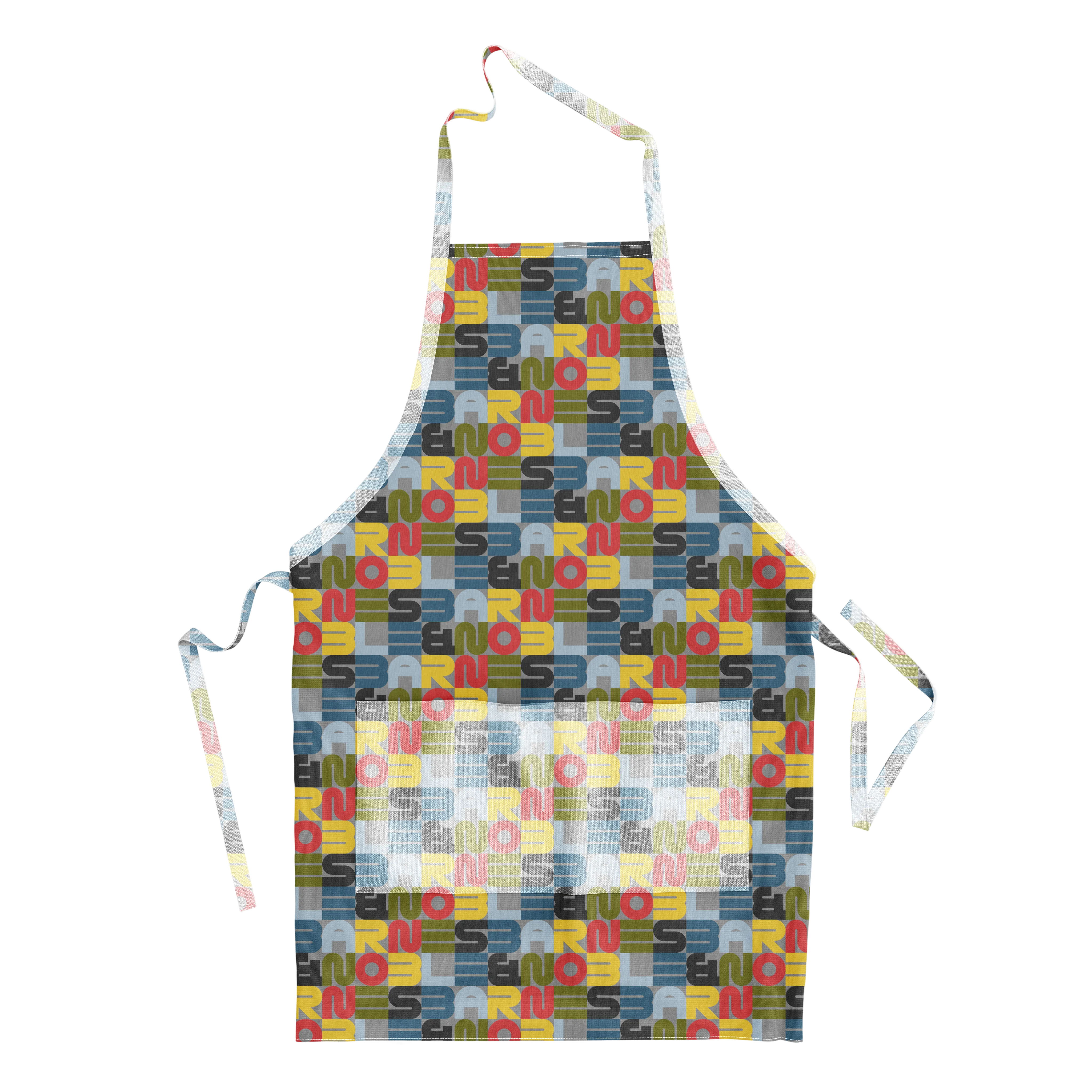
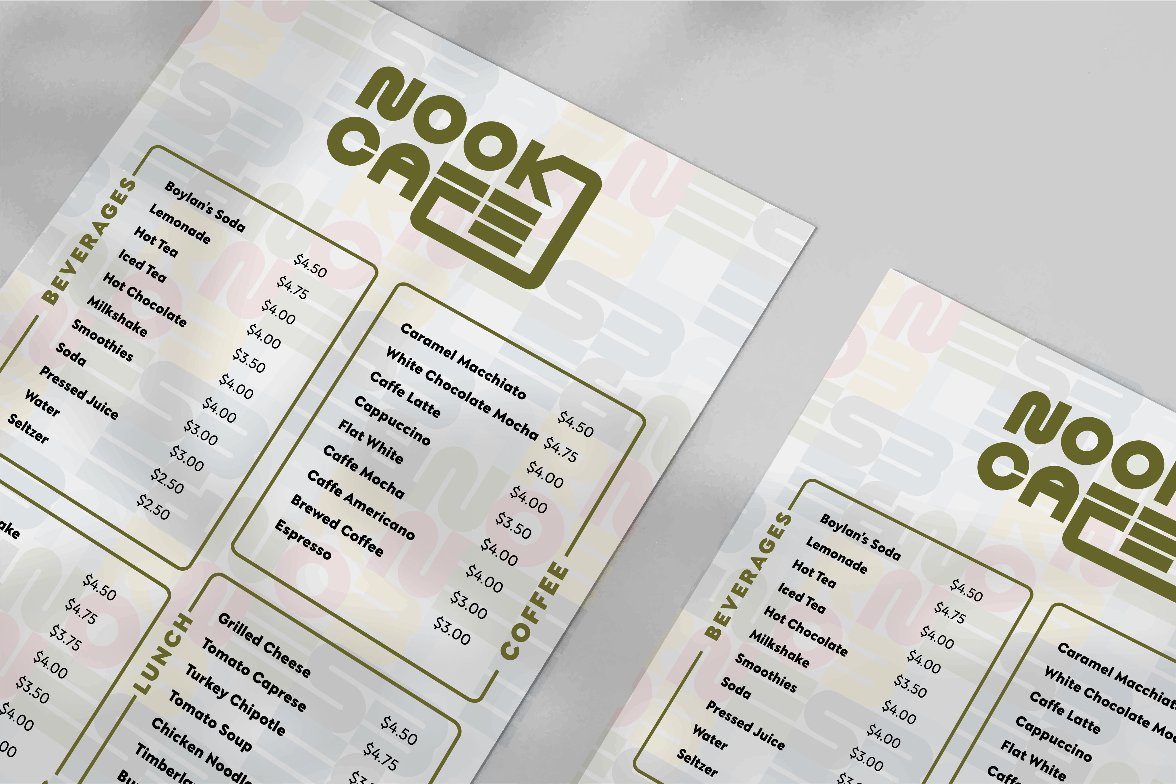
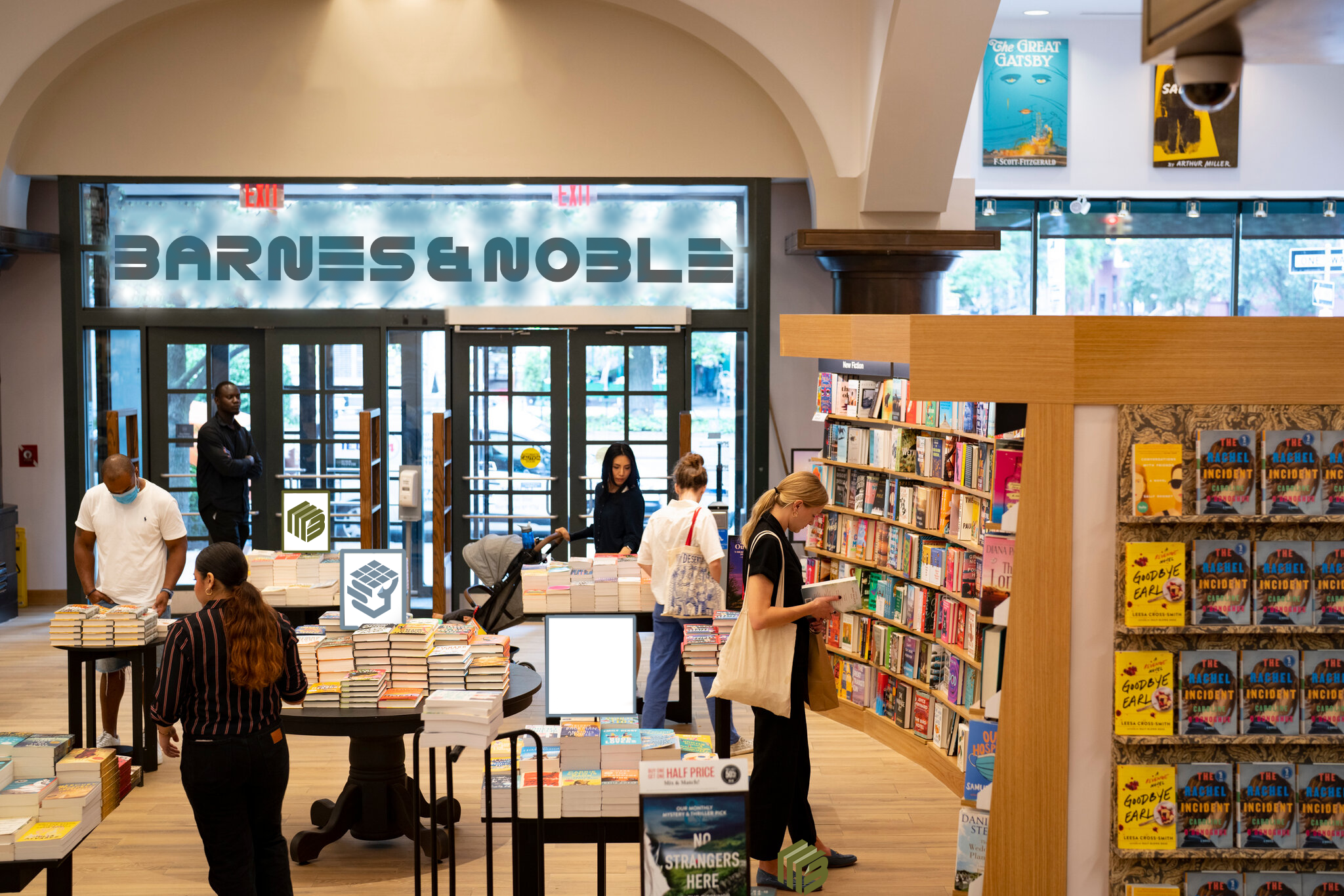
Applications


Why Rebrand Barnes and Noble?
Barnes & Noble shaped countless childhood memories, but its visual identity never matched its impact. This rebrand positions it as a true third space—welcoming, communal, and familiar—while updating the system and preserving the iconic ampersand for instant recognition.

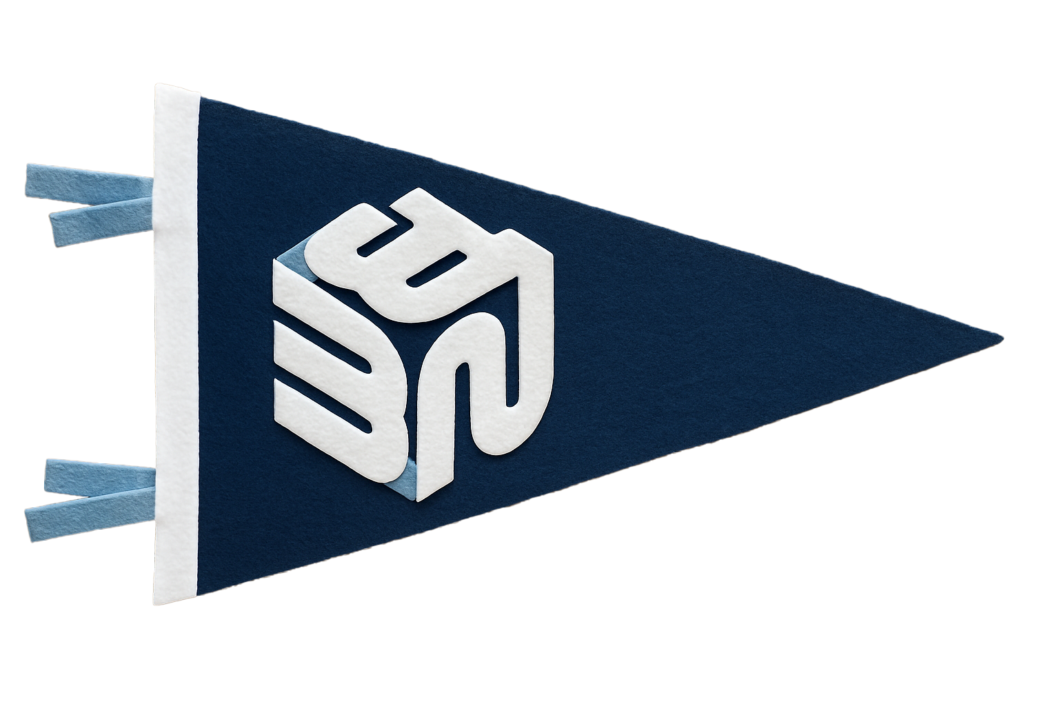
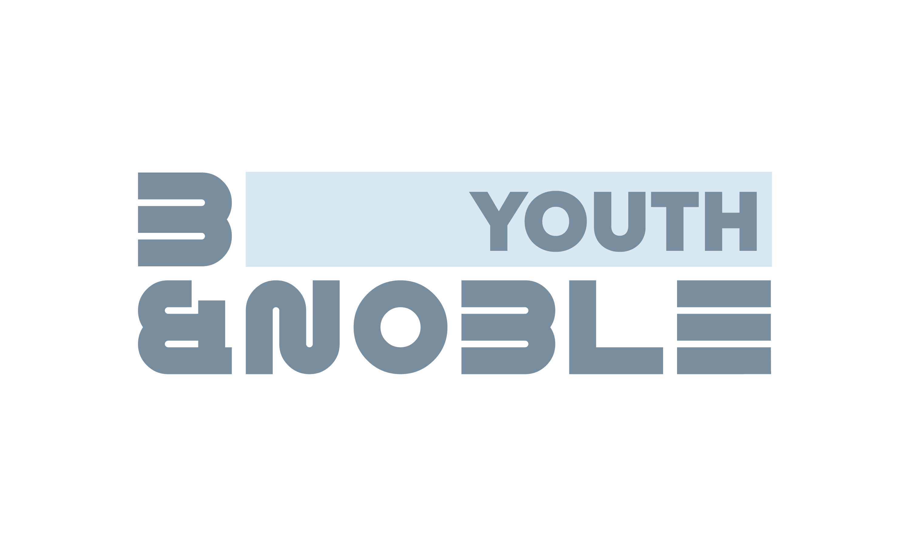
Logos


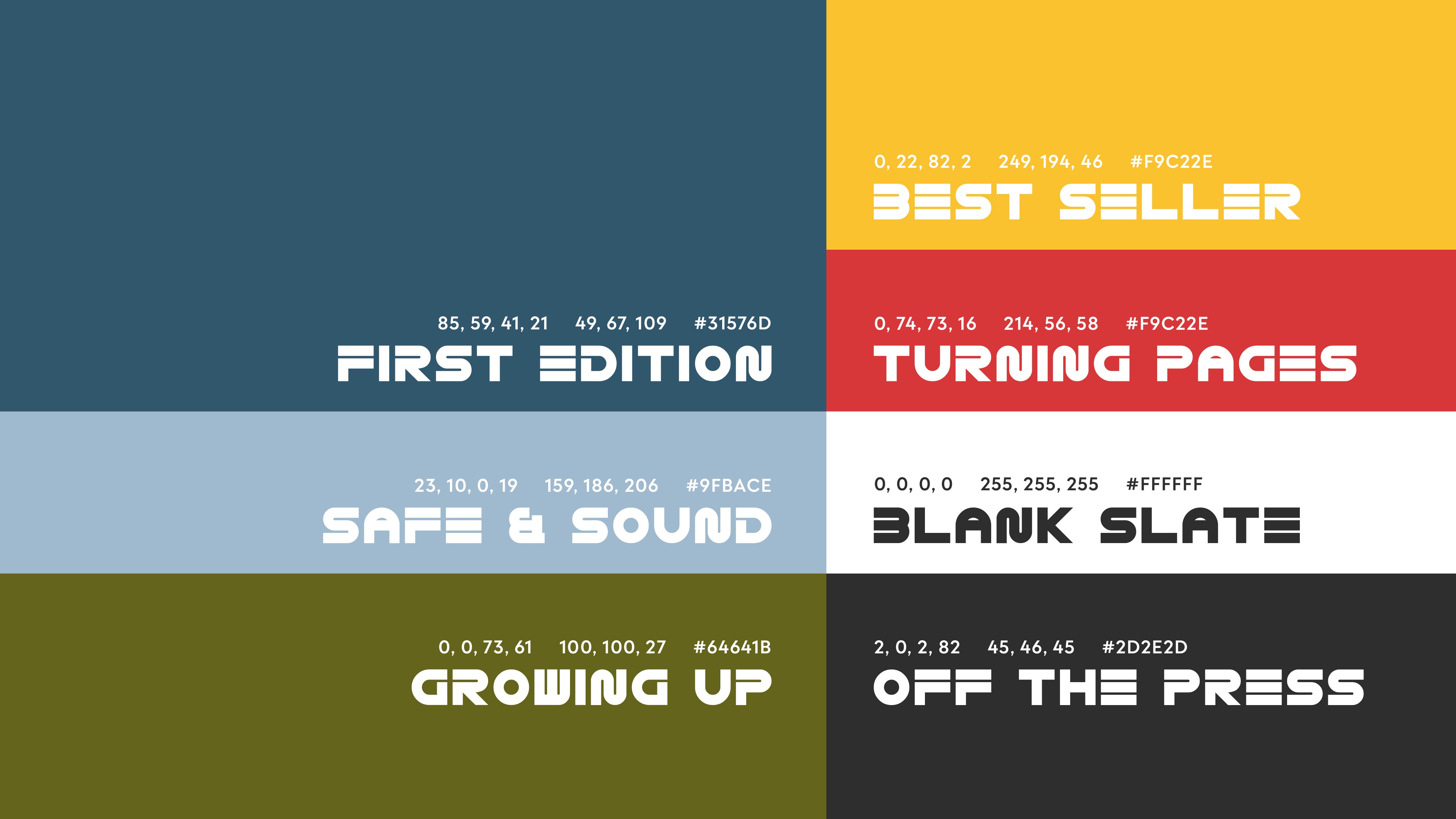
Colors


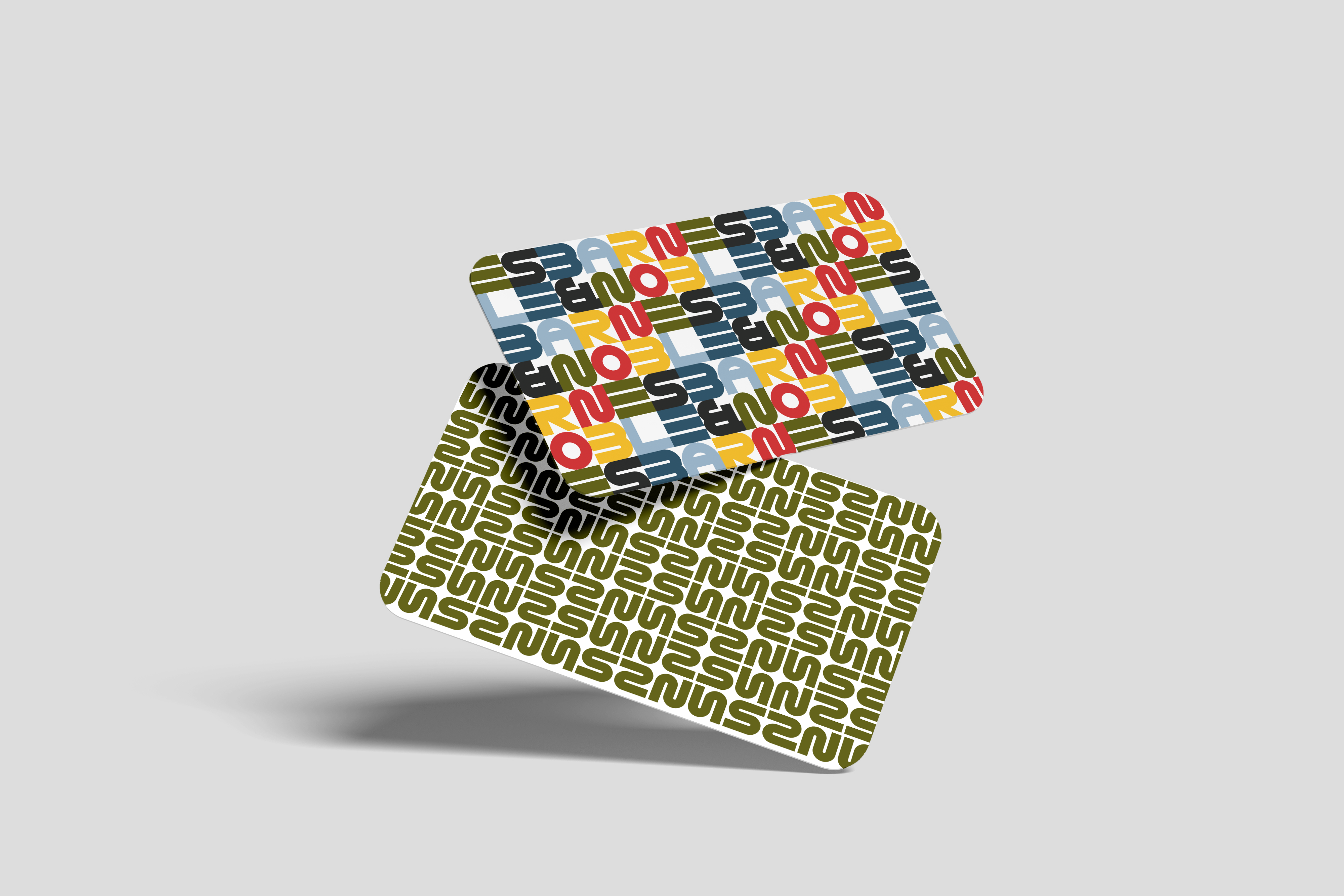
Patterns

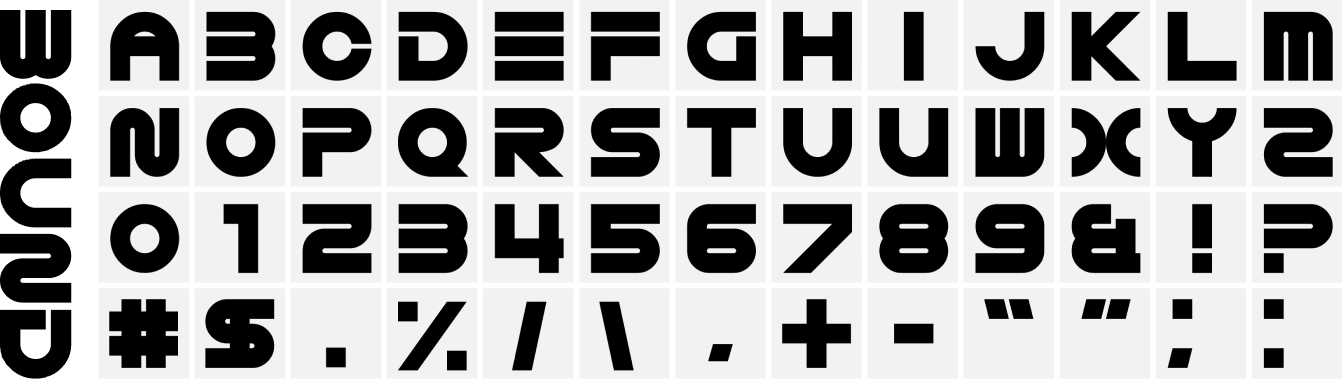
Dynamic System


Back


Barnes and Noble
Design System and Rebrand
Branding
Multi-Media
Student Work
Team Project


Why Rebrand Barnes and Noble?
Barnes & Noble shaped countless childhood memories, but its visual identity never matched its impact. This rebrand positions it as a true third space—welcoming, communal, and familiar—while updating the system and preserving the iconic ampersand for instant recognition.


Logos

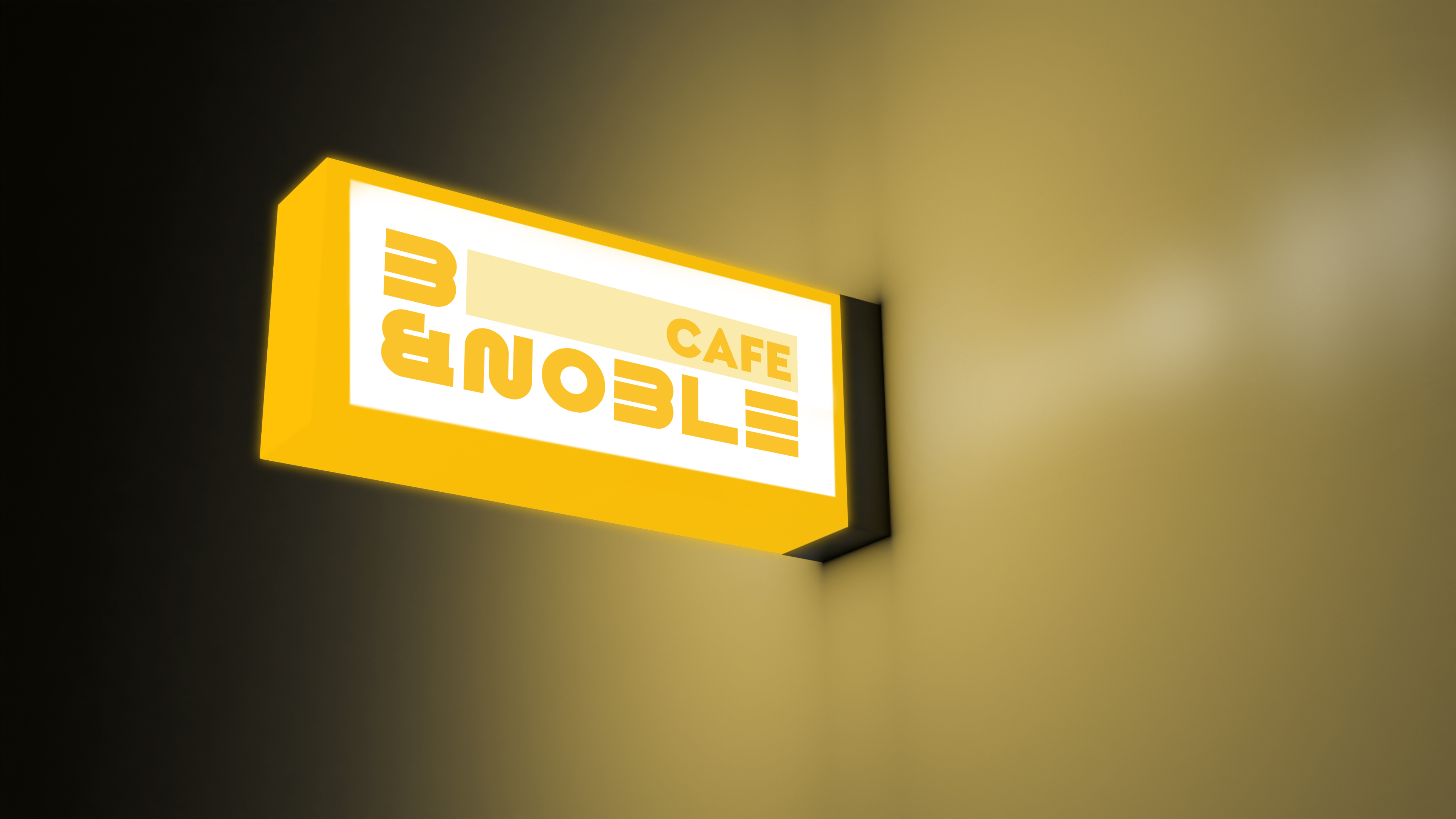
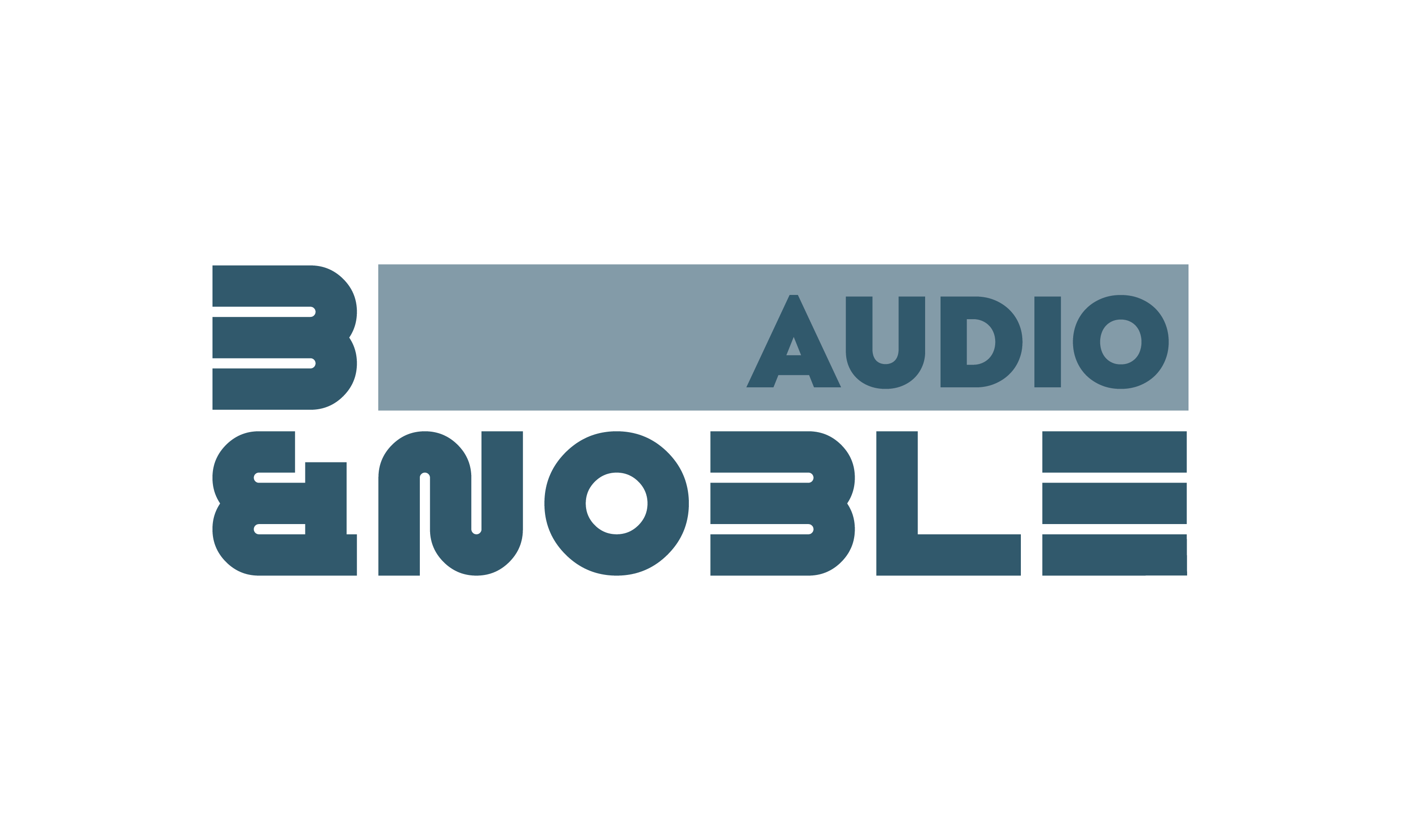
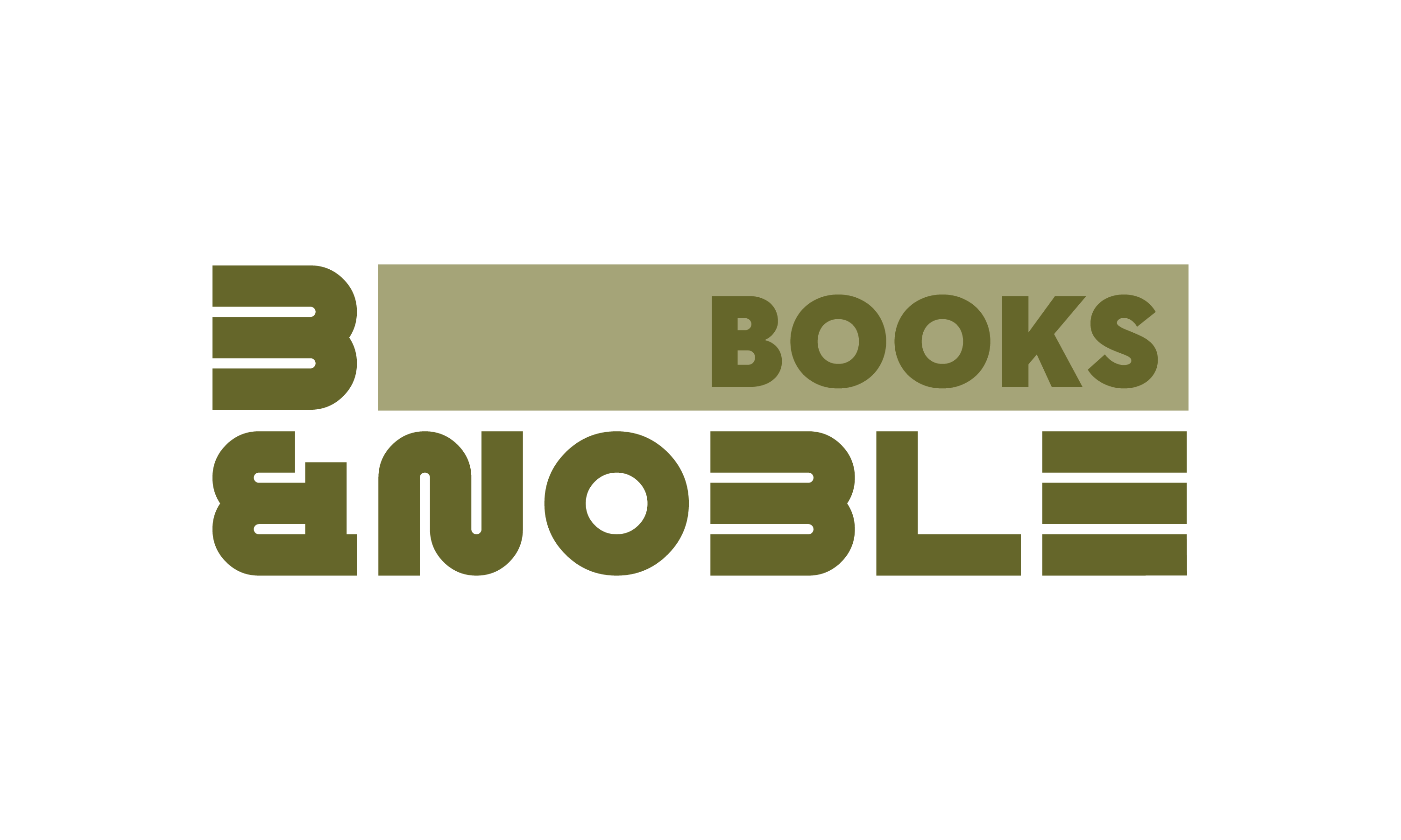
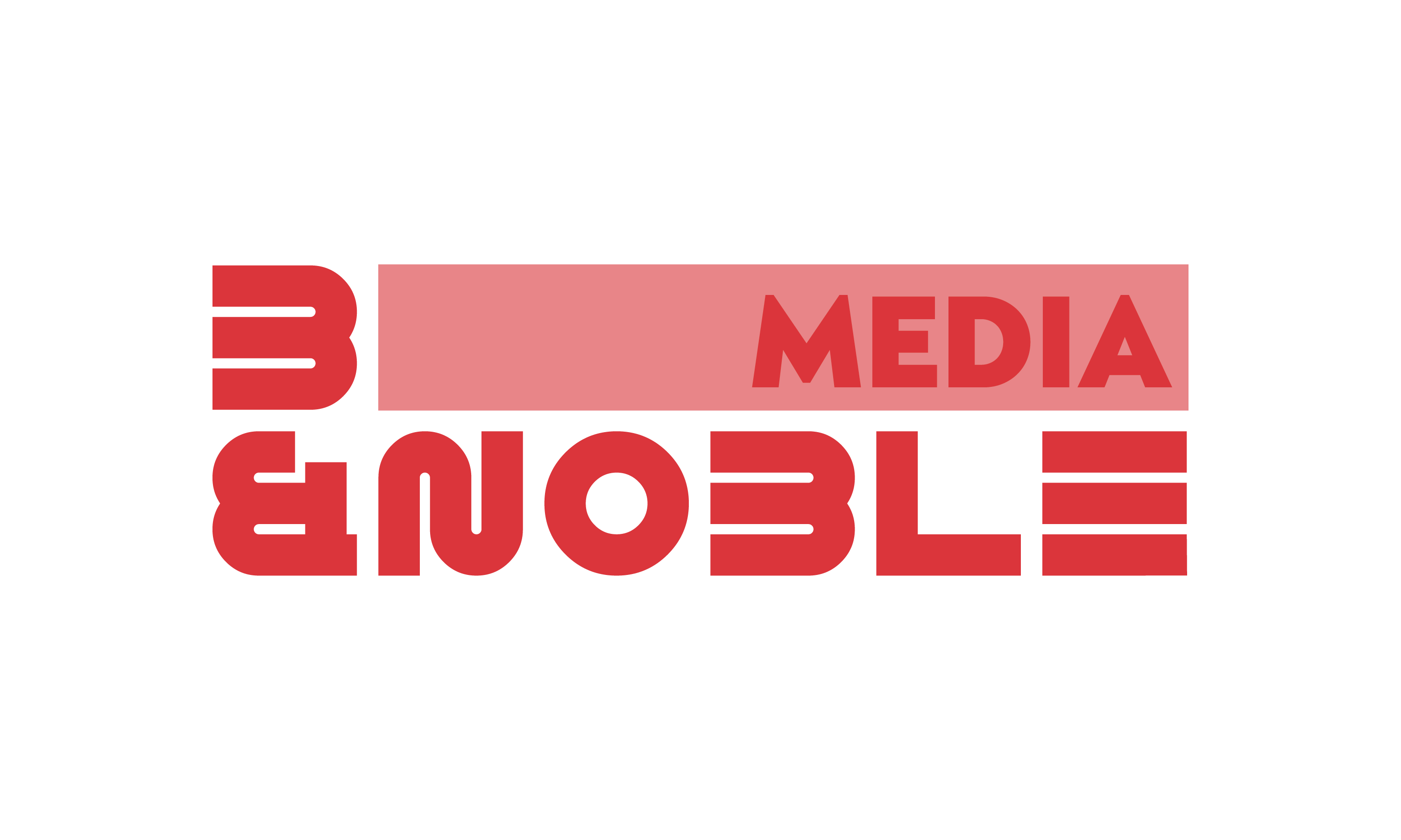
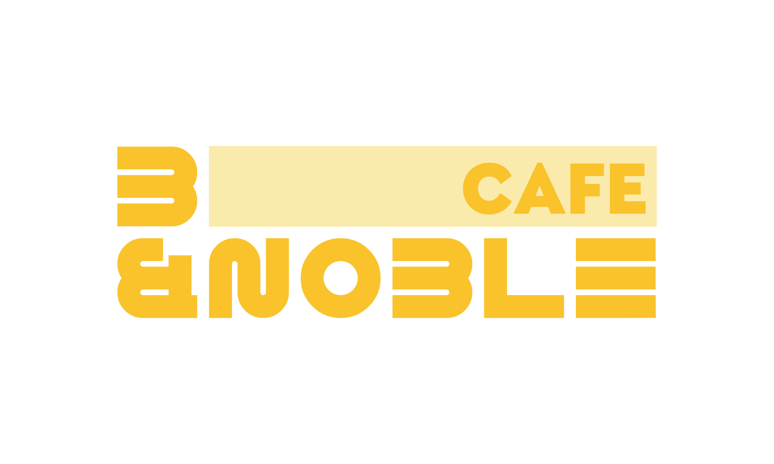
We designed this logo to reflect Barnes & Noble as a true third space—somewhere to think, unwind, and explore. The cube represents the in-store experience, while the reimagined ampersand stays central for instant recognition and brand heritage.
Why This Logo?

Color Story
Barnes & Noble’s palette is simple, primary, and academic—designed to resonate with young parents and students. Even the color names serve as subtle Easter eggs for anyone who
looks closer.


Patterns

Back
Applications

Dynamic System


Logos


Why Rebrand Barnes and Noble?
Barnes & Noble shaped countless childhood memories, but its visual identity never matched its impact. This rebrand positions it as a true third space—welcoming, communal, and familiar—while updating the system and preserving the iconic ampersand for instant recognition.
We designed this logo to reflect Barnes & Noble as a true third space—somewhere to think, unwind, and explore. The cube represents the in-store experience, while the reimagined ampersand stays central for instant recognition and brand heritage.
Why This Logo?
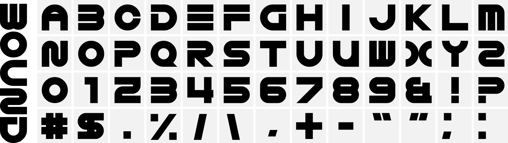
Dynamic System


Patterns
Color Story
Barnes & Noble’s palette is simple, primary, and academic—designed to resonate with young parents and students. Even the color names serve as subtle Easter eggs for anyone who
looks closer.


Duration: 15 Weeks
Tools: Illustrator, Photoshop, Figma, After Effects.
Team: Myself, Kate Schatz, Alex Fisher, & Anastasia Sarvas
Branding
Multi-Media
Student Work
Team Project
Barnes and Noble
Design System and Rebrand
Back
Applications


Back
Branding
Multi-Media
Student Work
Team Project
Barnes and Noble
Design System and Rebrand

Duration: 15 Weeks
Tools: Illustrator, Photoshop, Figma, After Effects, Midjourney.
Team: Myself, Kate Schatz, Alex Fisher, & Anastasia Sarvas
Applications
We designed this logo to reflect Barnes & Noble as a true third space—somewhere to think, unwind, and explore. The cube represents the
in-store experience, while the reimagined ampersand stays central for instant recognition and brand heritage.
Why This Logo?

Why Rebrand Barnes and Noble?
Barnes & Noble shaped countless childhood memories, but its visual identity never matched its impact. This rebrand positions it as a true third space—welcoming, communal, and familiar—while updating the system and preserving the iconic ampersand for instant recognition.


Logos

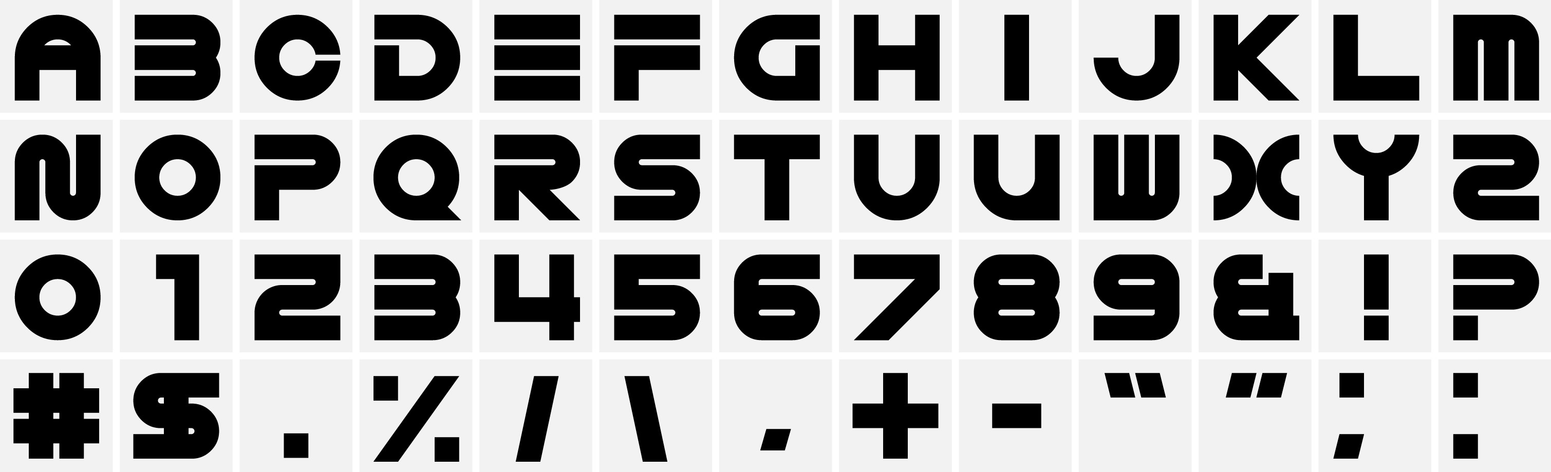

Dynamic System
Color Story
Barnes & Noble’s palette is simple, primary, and academic—designed to resonate with young parents and students. Even the color names serve as subtle Easter eggs for anyone who
looks closer.


Patterns