
Executions
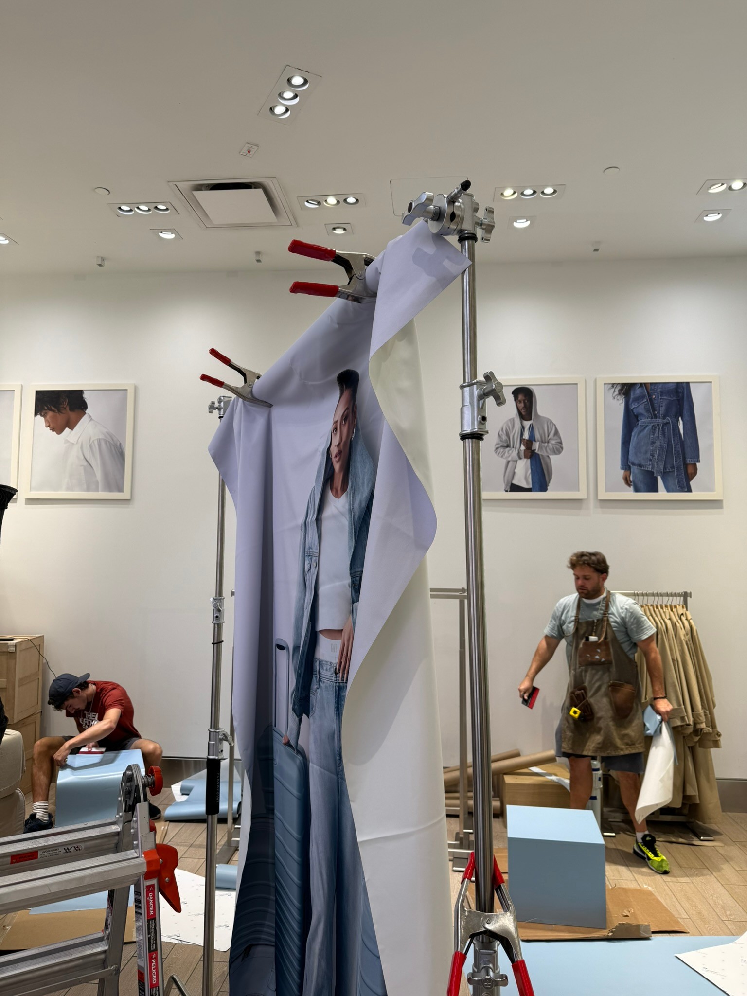
Process
Process
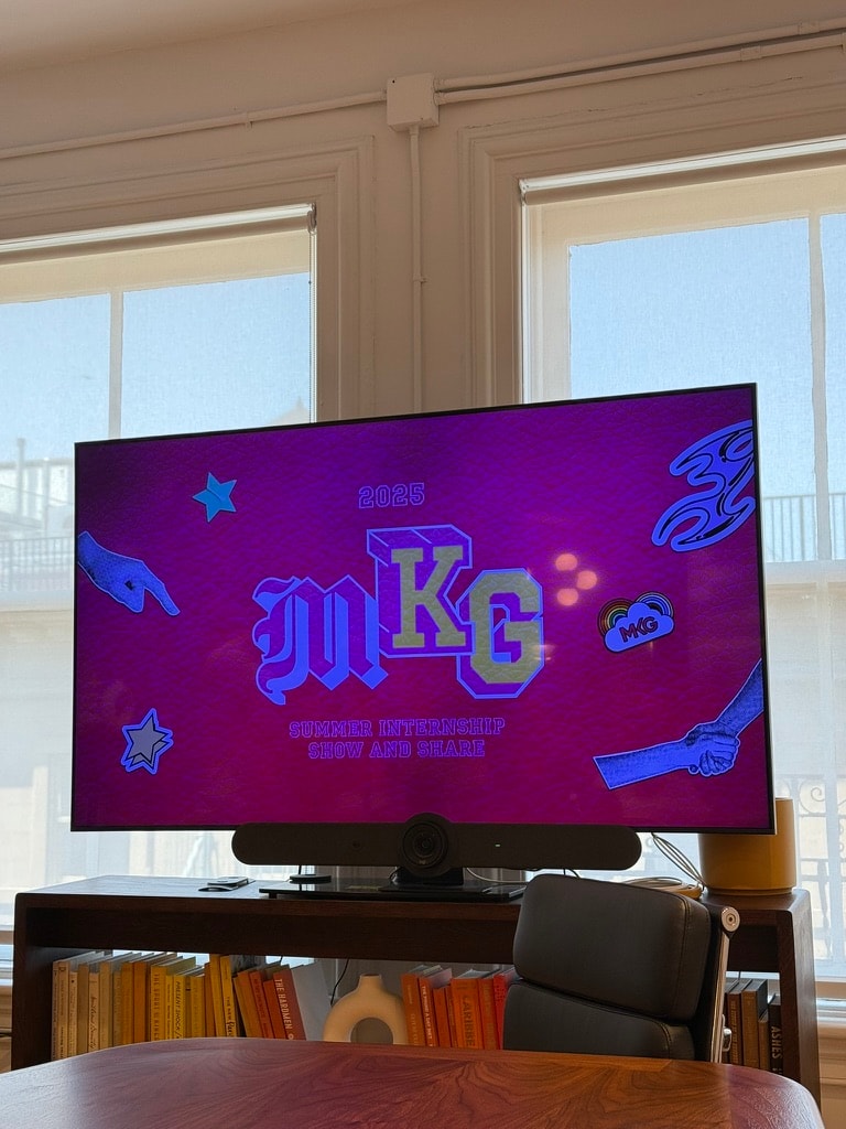
2025
Fine Arts
Fine Arts
British Airways Rebrand
Student Work
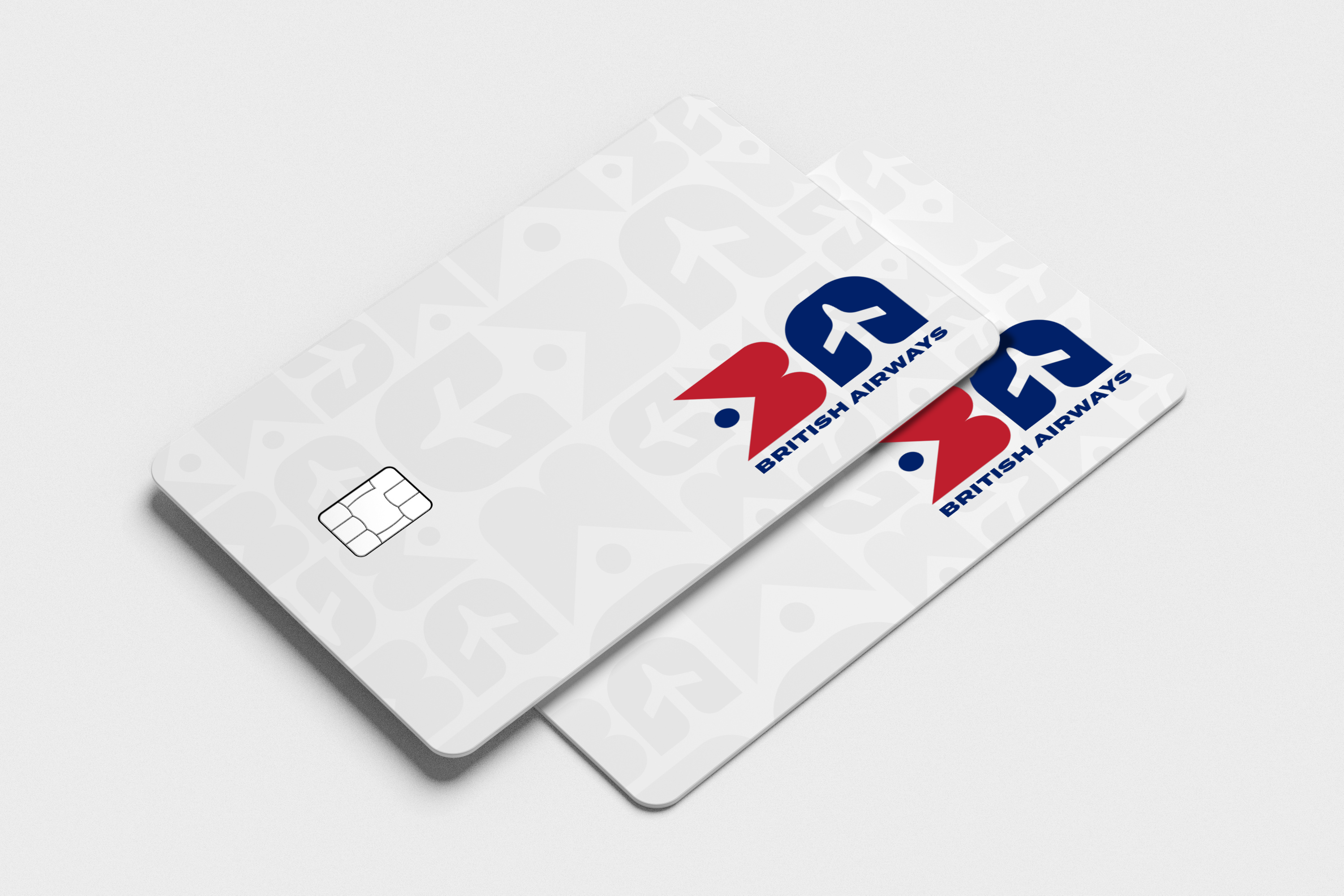
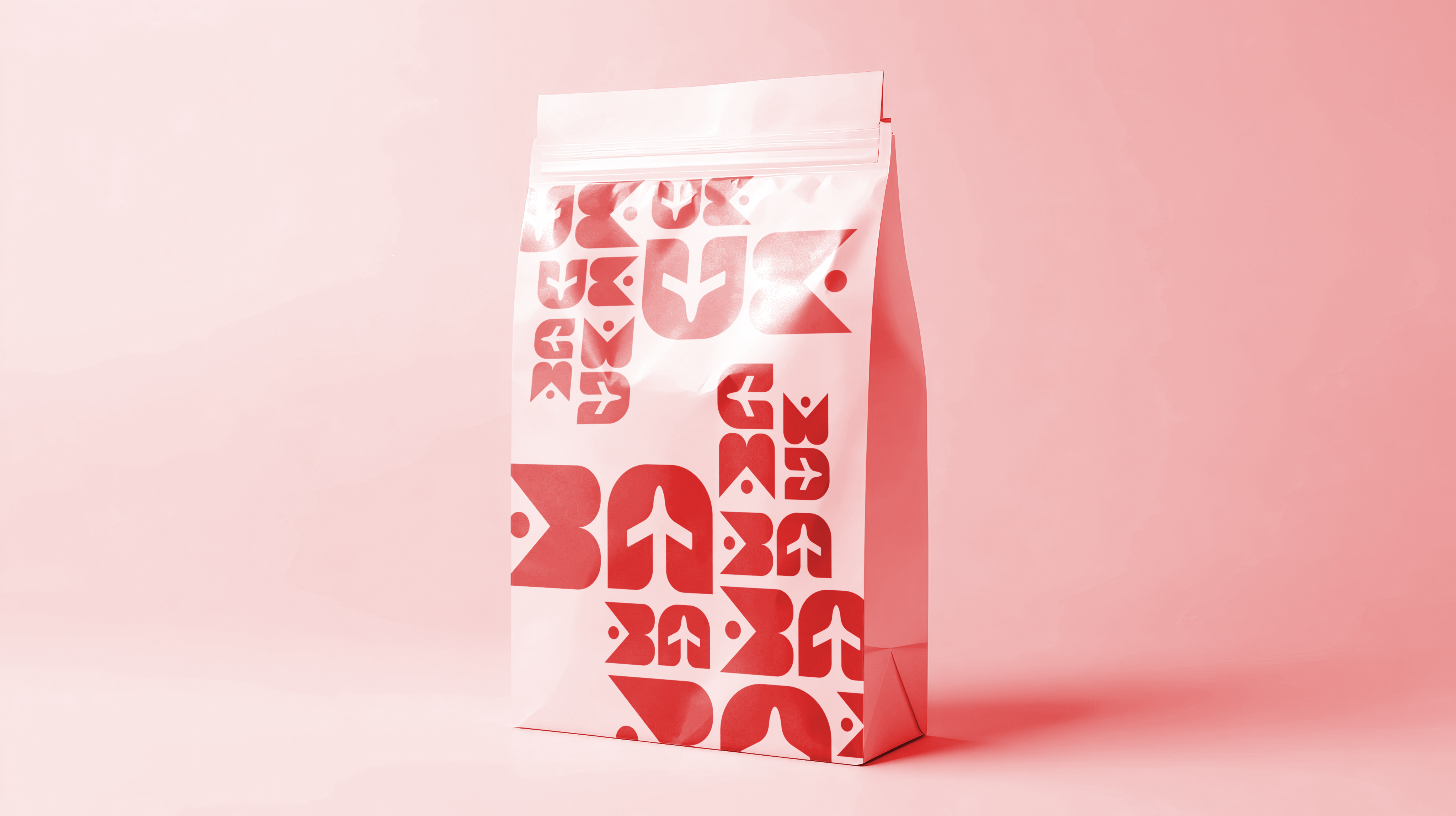
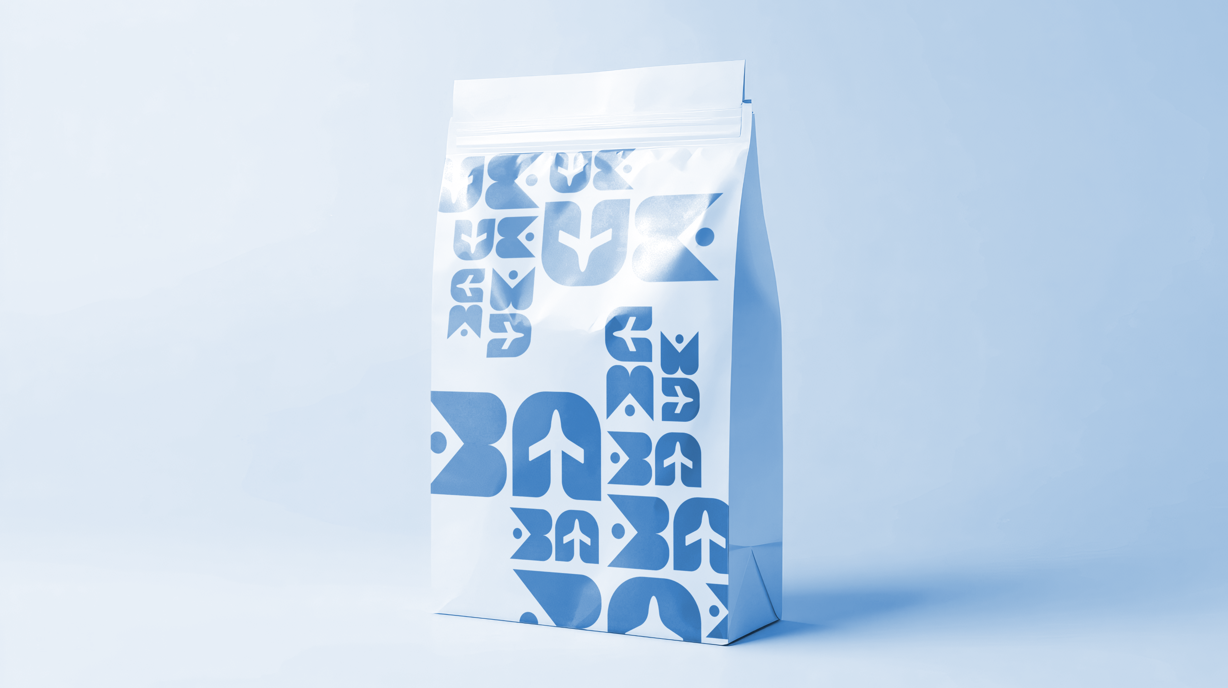
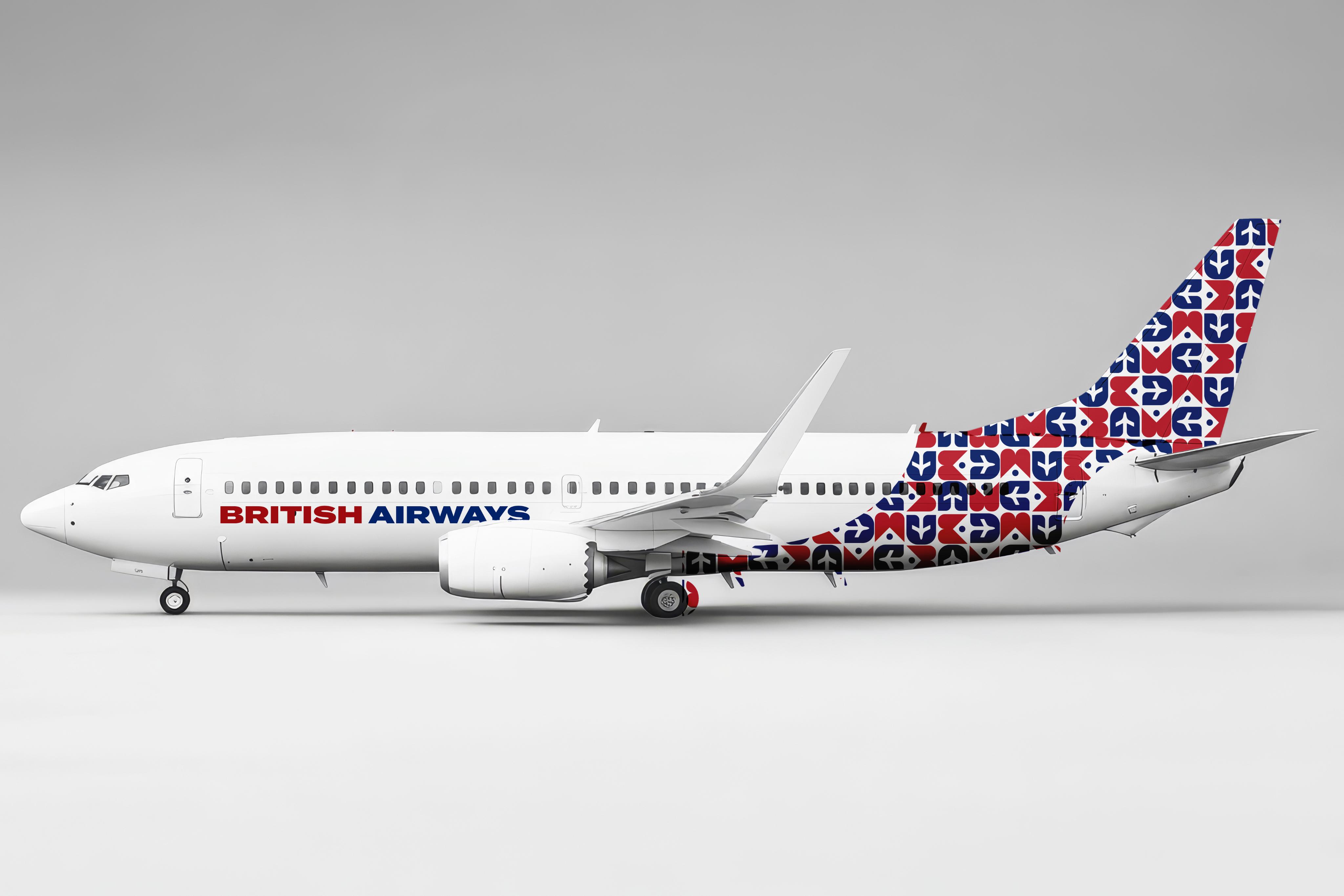
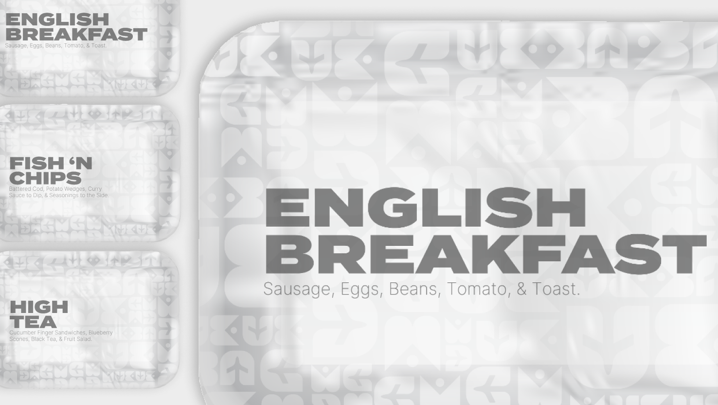
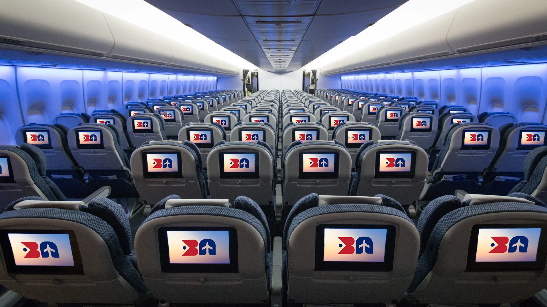
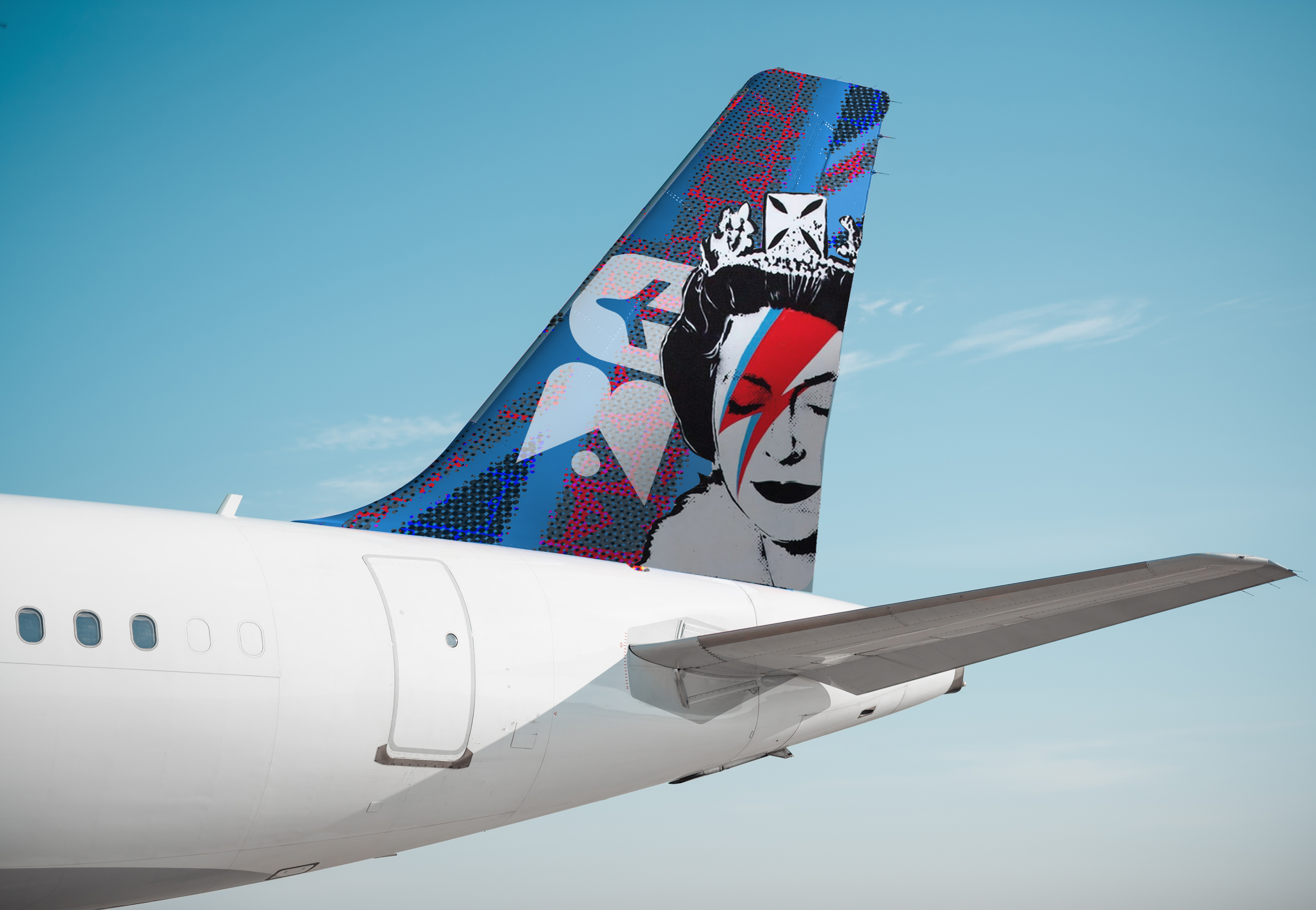
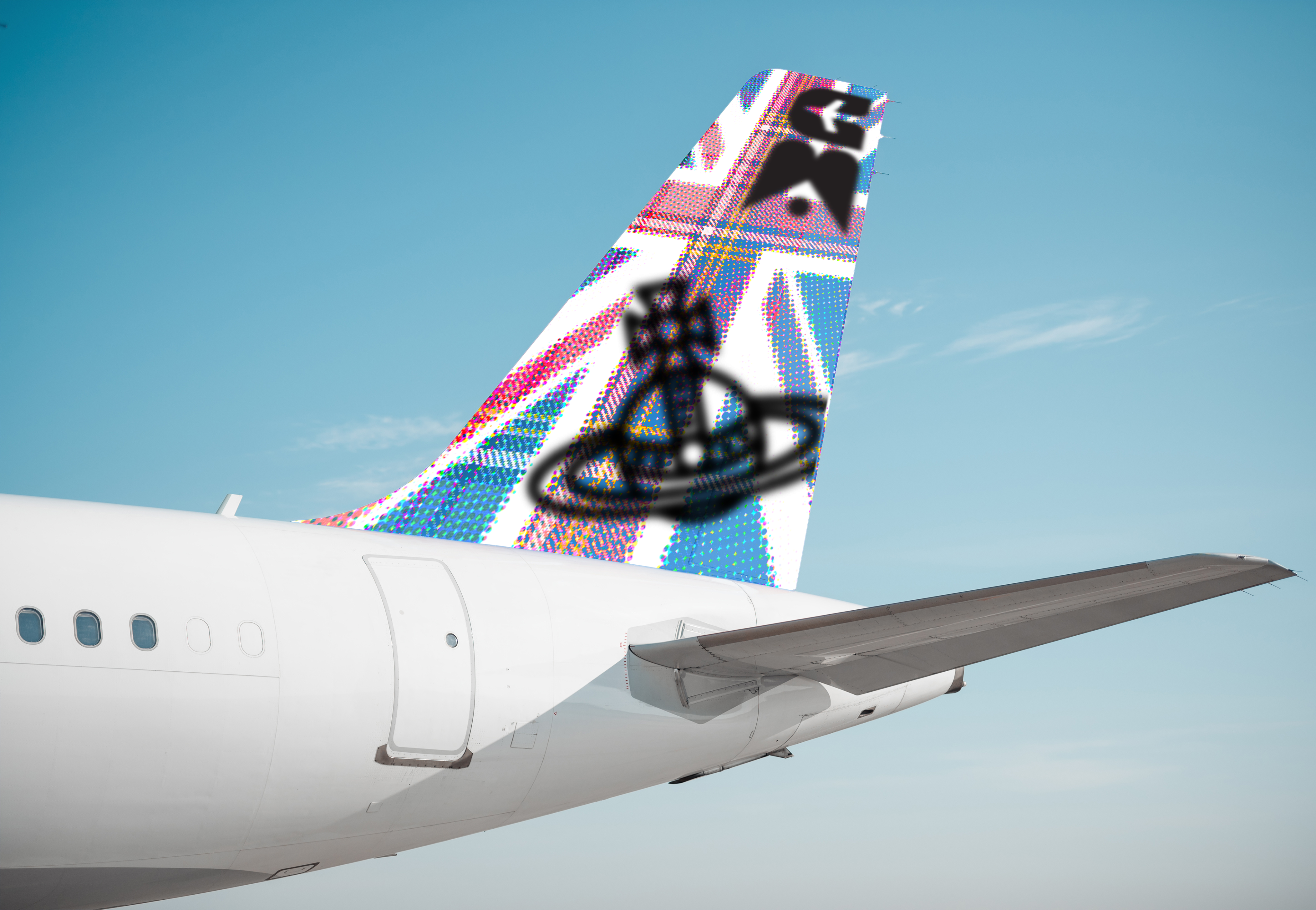
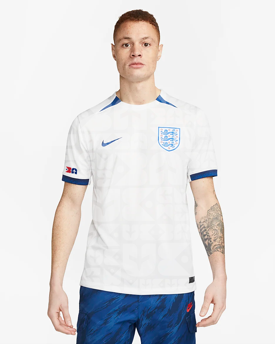
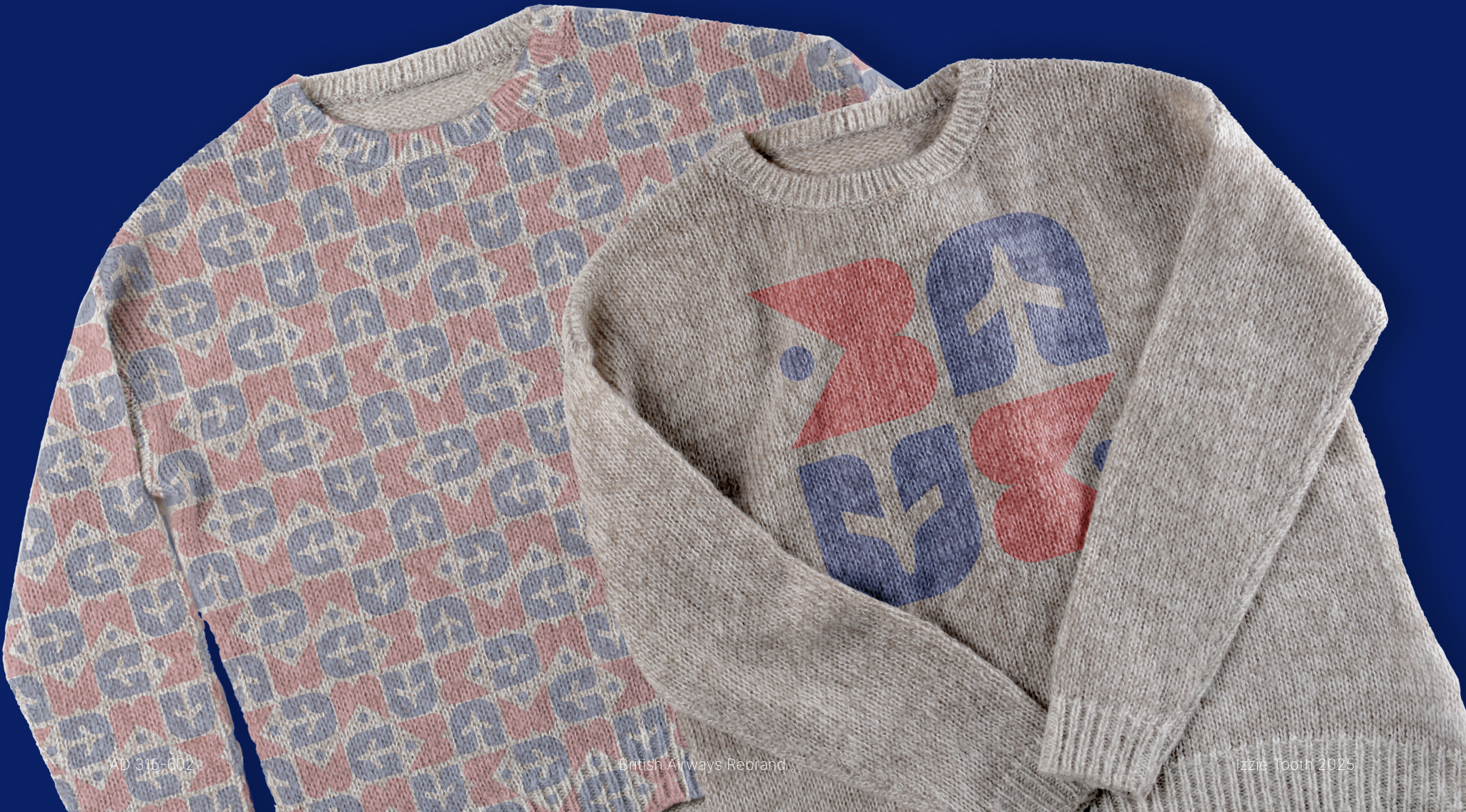
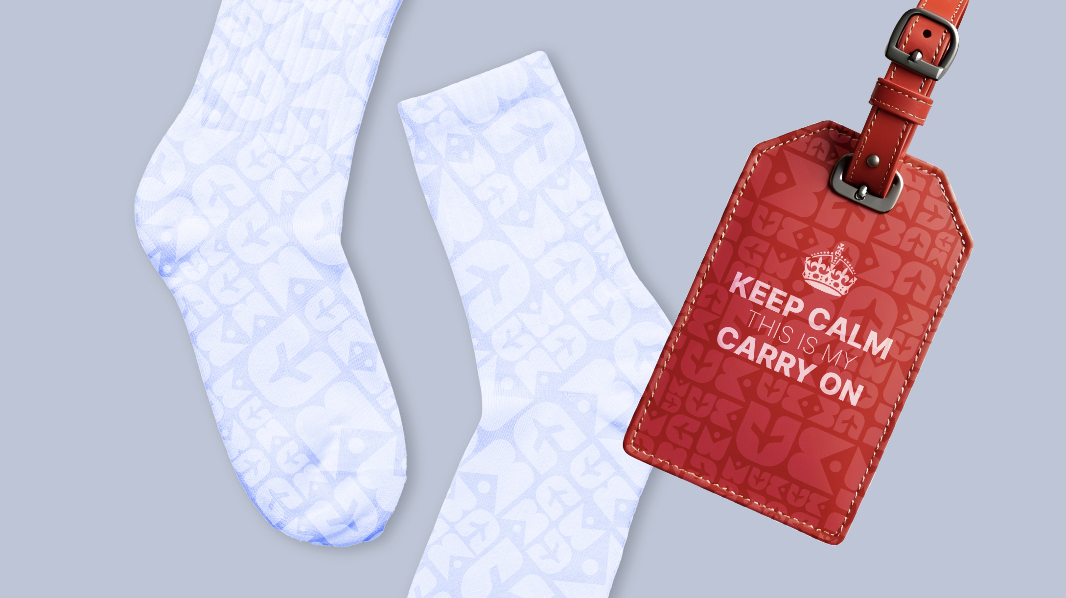
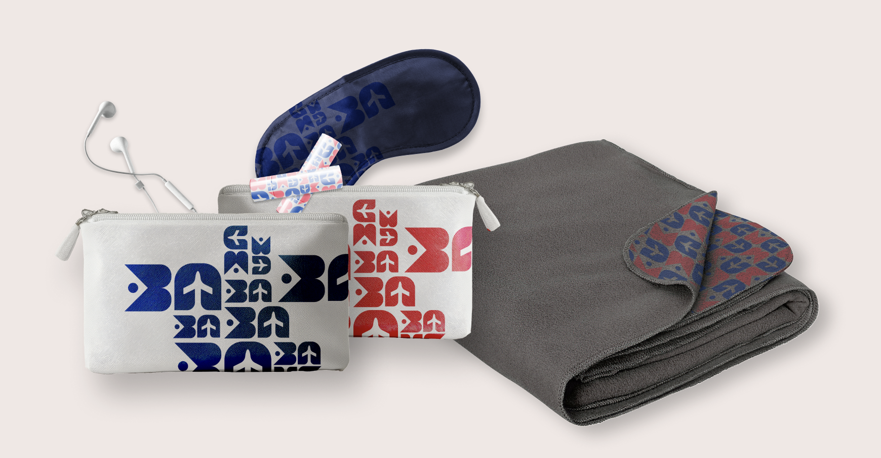
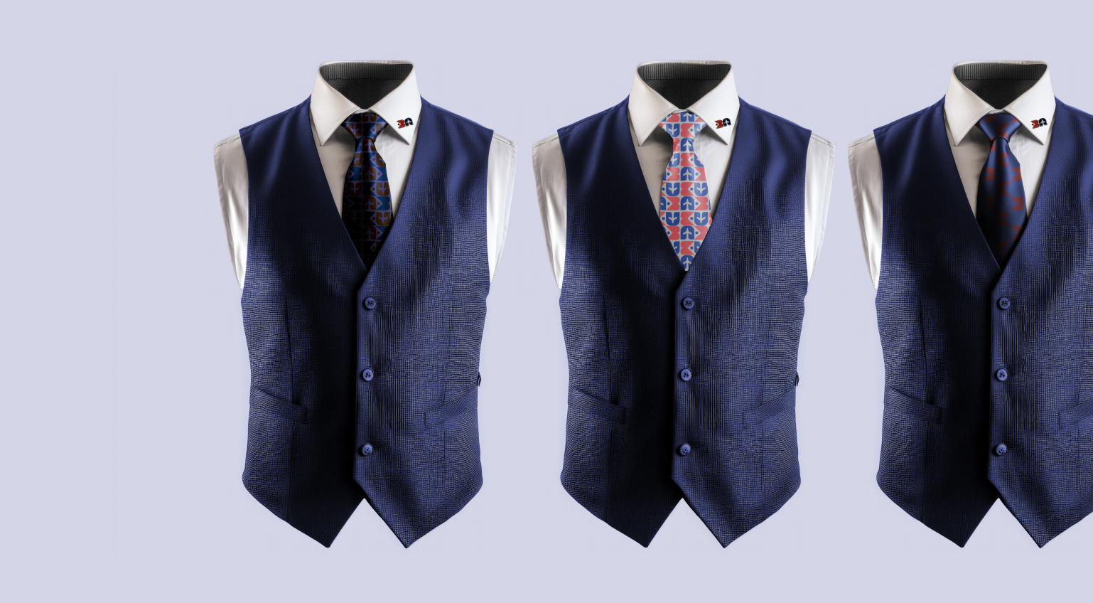
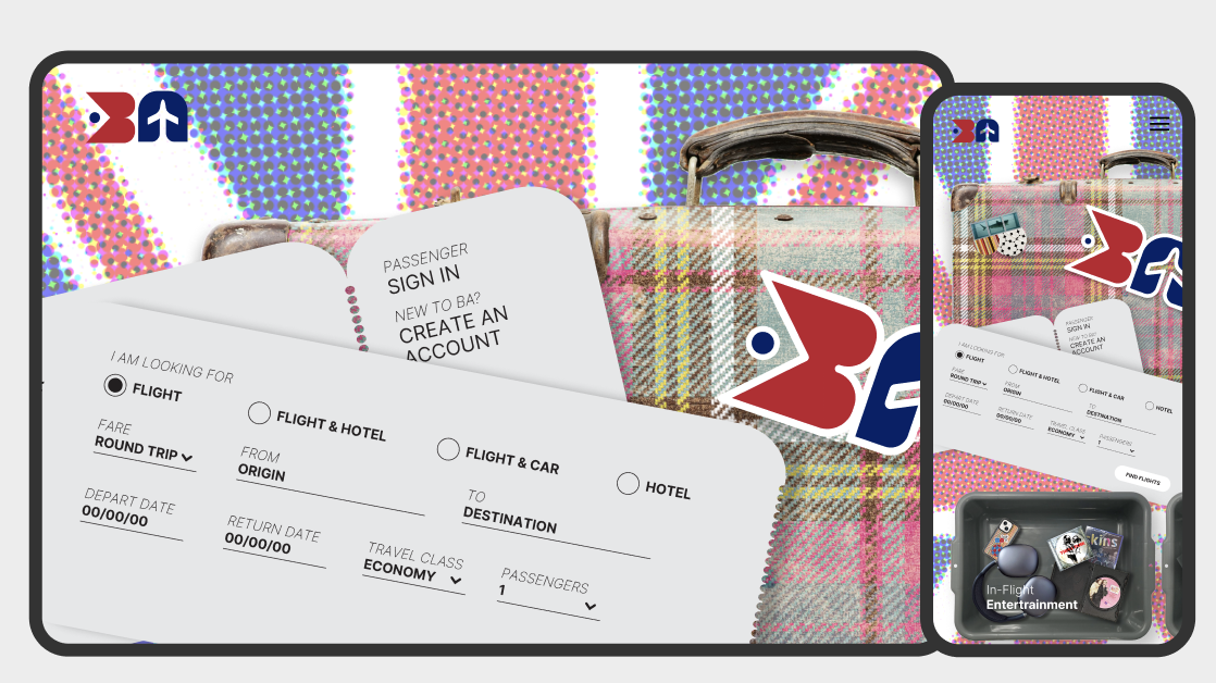
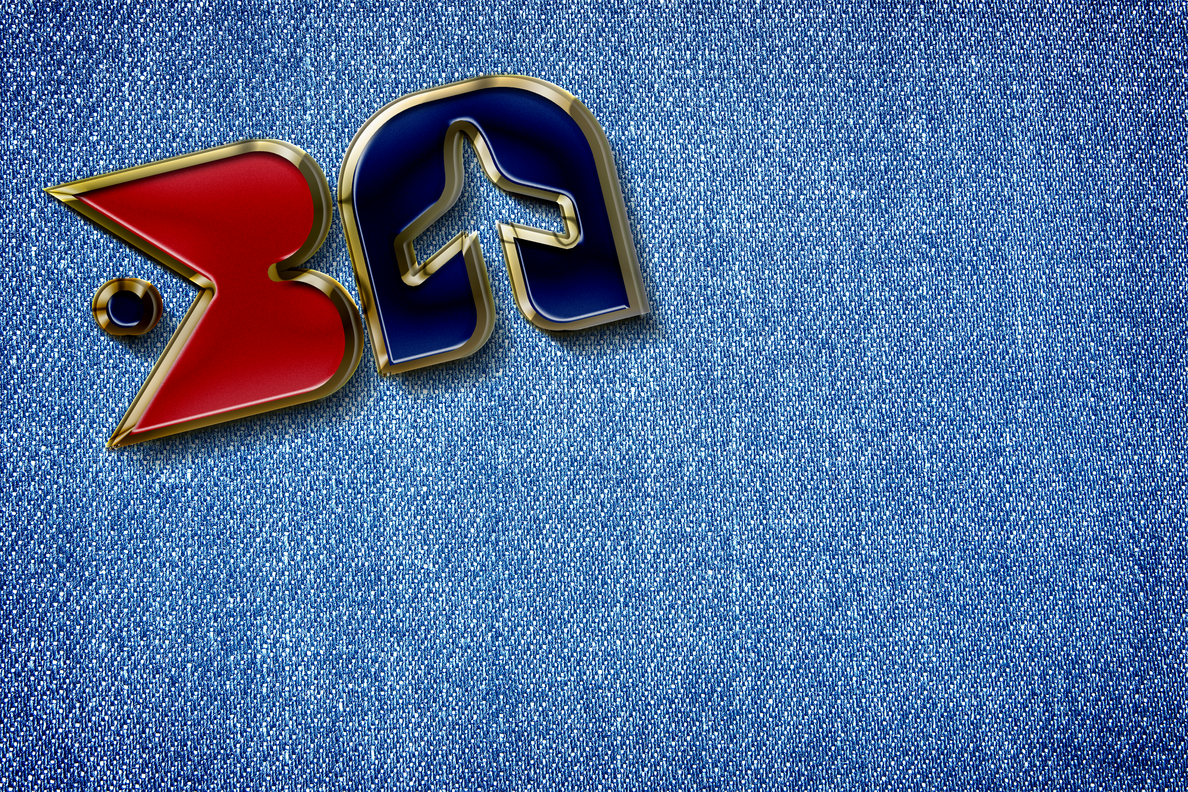
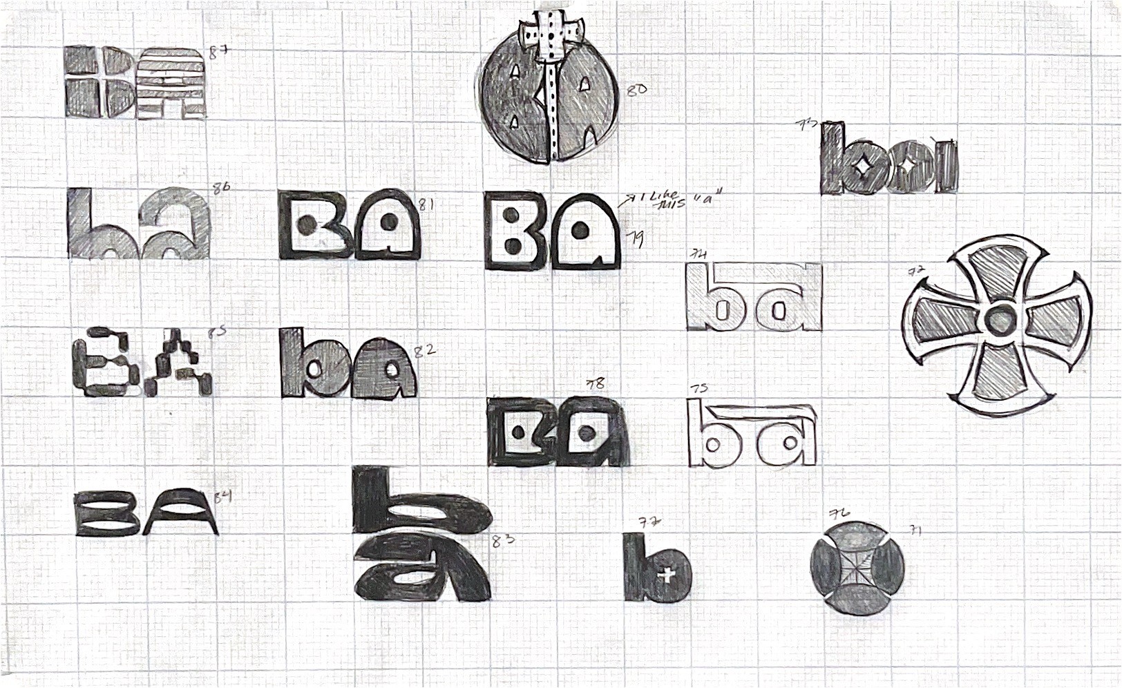
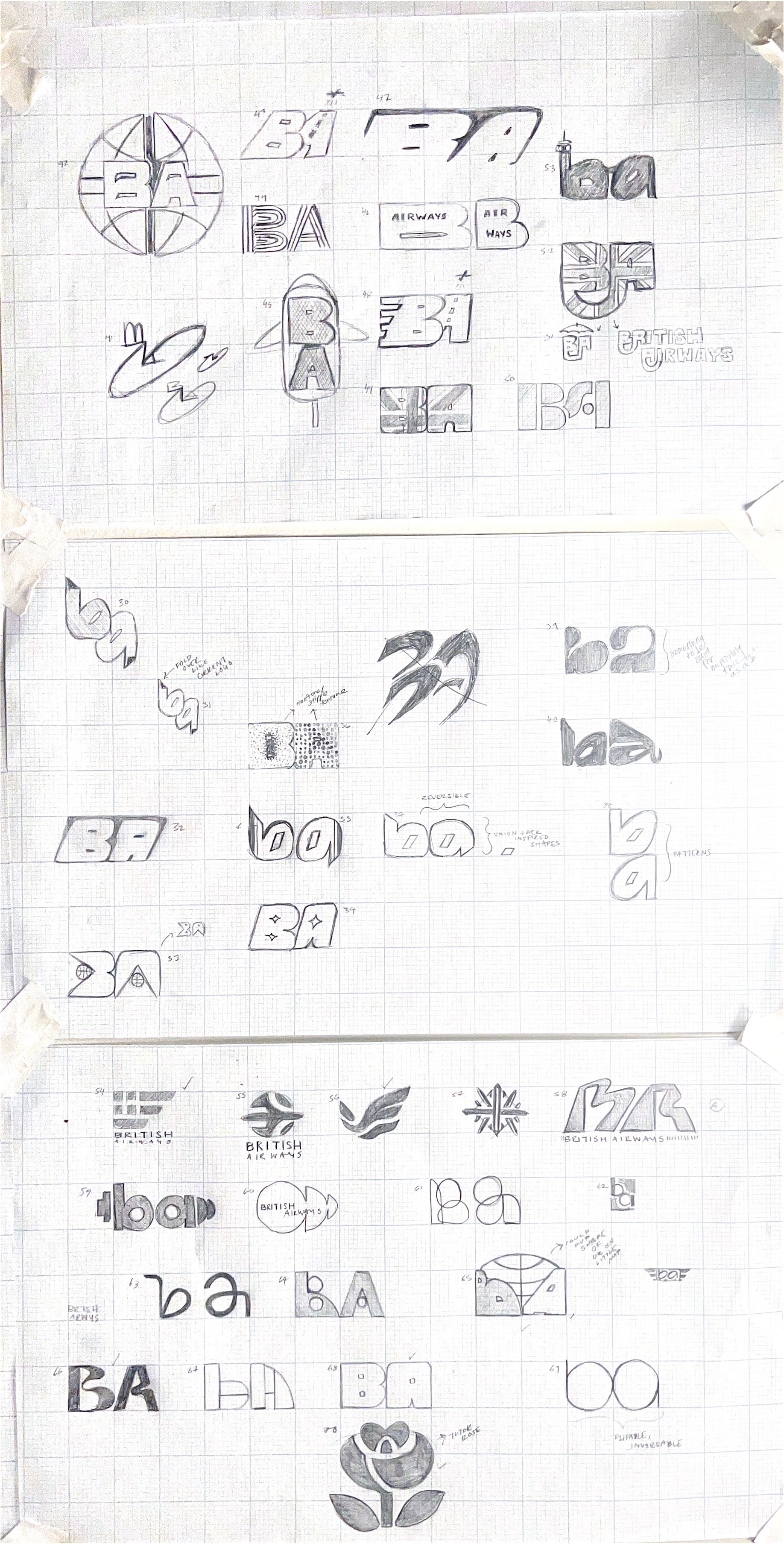
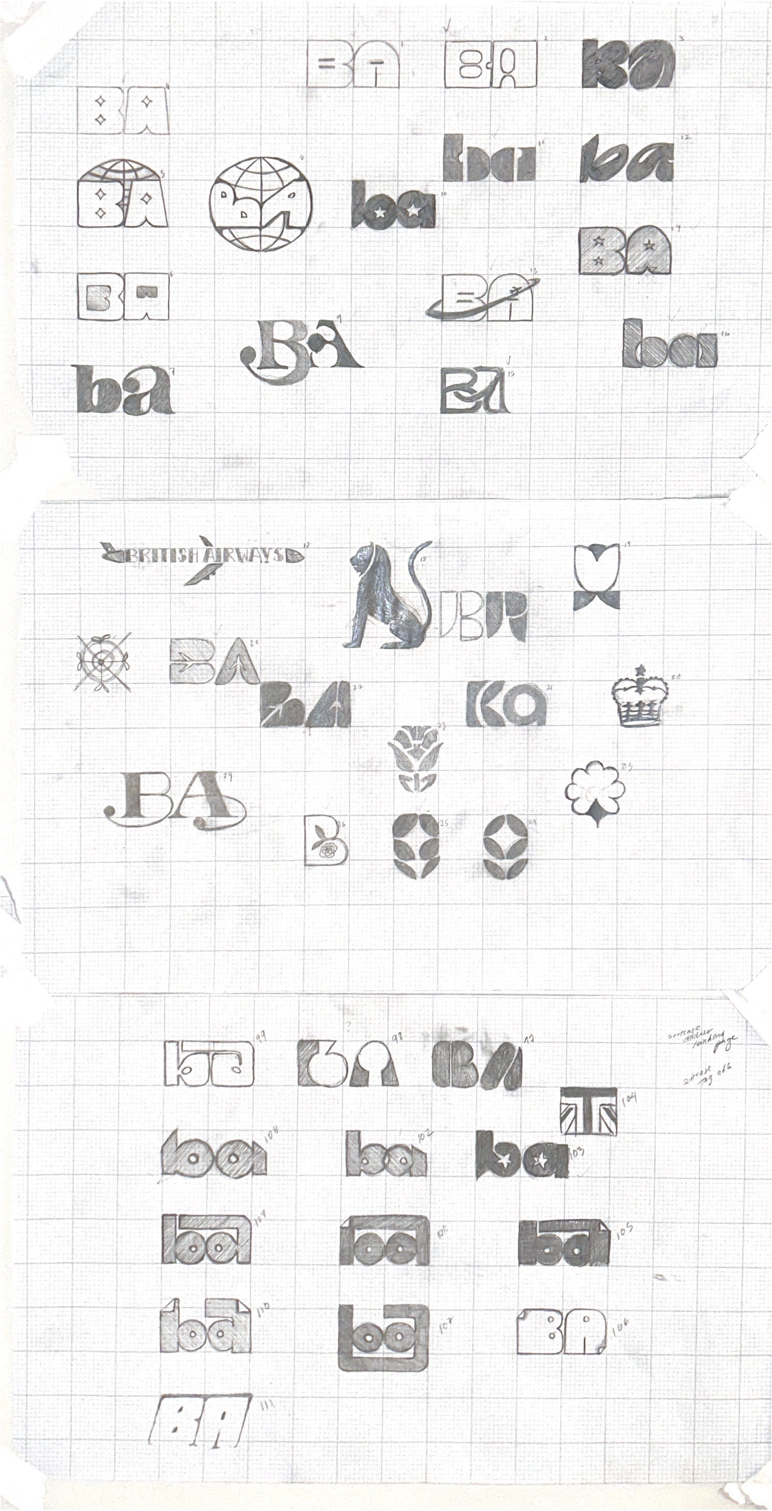
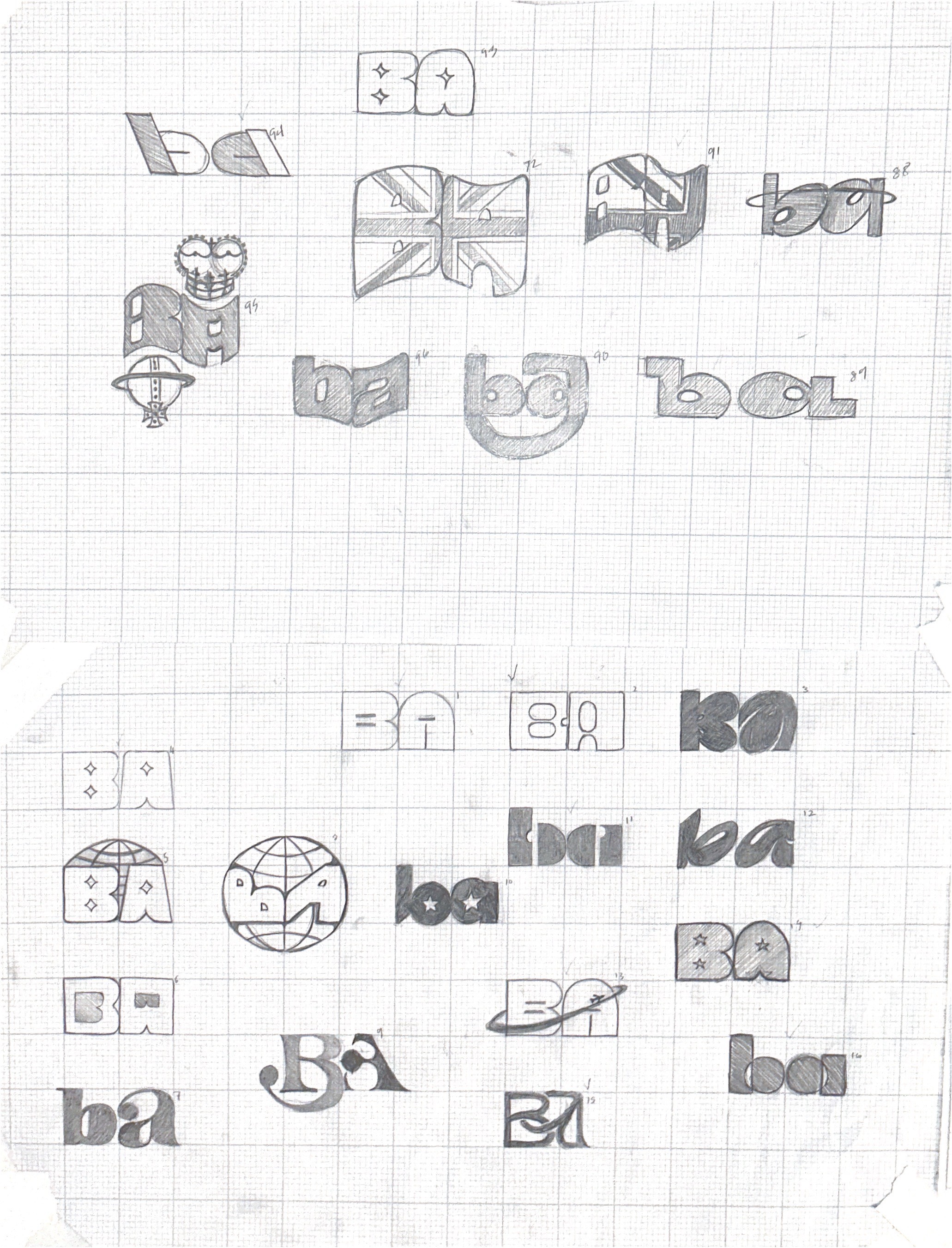
British Airways is a cultural symbol, but its identity feels massively outdated, This rebrand modernizes the experience so the journey to England begins the moment passengers board the aircraft. I felt that their colors still worked so I refined them to match the union jack hex codes for a clearer connection to British heritage. After 100s of logo sketches I created a logo that builds a cohesive patternable system, drawing inspiration from mid century modern aviation identity design.
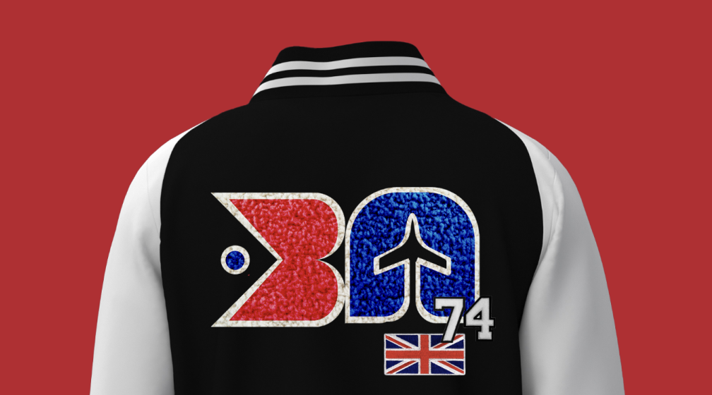
In this project, I used AI to more fully visualize my mock-ups and show the real potential of my concepts. I designed a varsity jacket mock-up and then used MidJourney to generate an animation of someone modeling it. I uploaded my original designs as references to maintain visual fidelity and keep the color language consistent throughout the mock-ups. I like to try to think of AI as a creative partner, not the enemy. On the right is the original quick photoshop mock up I made to get my idea across and on the left is the AI video I generated of my design using the mock as a reference image.
Back to Home


Executions
Process
How I Use AI in my Workflow
2025
2025
AI Assisted Design
Back to Home

British Airways Rebrand
Student Work
British Airways is a cultural symbol, but its identity feels massively outdated, This rebrand modernizes the experience so the journey to England begins the moment passengers board the aircraft. I felt that their colors still worked so I refined them to match the union jack hex codes for a clearer connection to British heritage. After 100s of logo sketches I created a logo that builds a cohesive patternable system, drawing inspiration from mid century modern aviation identity design.
In this project, I used AI to more fully visualize my mock-ups and show the real potential of my concepts. I designed a varsity jacket mock-up and then used MidJourney to generate an animation of someone modeling it. I uploaded my original designs as references to maintain visual fidelity and keep the color language consistent throughout the mock-ups. I like to try to think of AI as a creative partner, not the enemy. On the right is the original quick photoshop mock up I made to get my idea across and on the left is the AI video I generated of my design using the mock as a reference image.

Student Work
British Airways Rebrand
Executions
Process
How I Use AI in my Workflow
2025
Sketches
AI Assisted
Back to Home
British Airways is a cultural symbol, but its identity feels massively outdated, This rebrand modernizes the experience so the journey to England begins the moment passengers board the aircraft. I felt that their colors still worked so I refined them to match the union jack hex codes for a clearer connection to British heritage. After 100s of logo sketches I created a logo that builds a cohesive patternable system, drawing inspiration from mid century modern aviation identity design.
In this project, I used AI to more fully visualize my mock-ups and show the real potential of my concepts. I designed a varsity jacket mock-up and then used MidJourney to generate an animation of someone modeling it. I uploaded my original designs as references to maintain visual fidelity and keep the color language consistent throughout the mock-ups. I like to try to think of AI as a creative partner, not the enemy. On the right is the original quick photoshop mock up I made to get my idea across and on the left is the AI video I generated of my design using the mock as a reference image.