
Executions
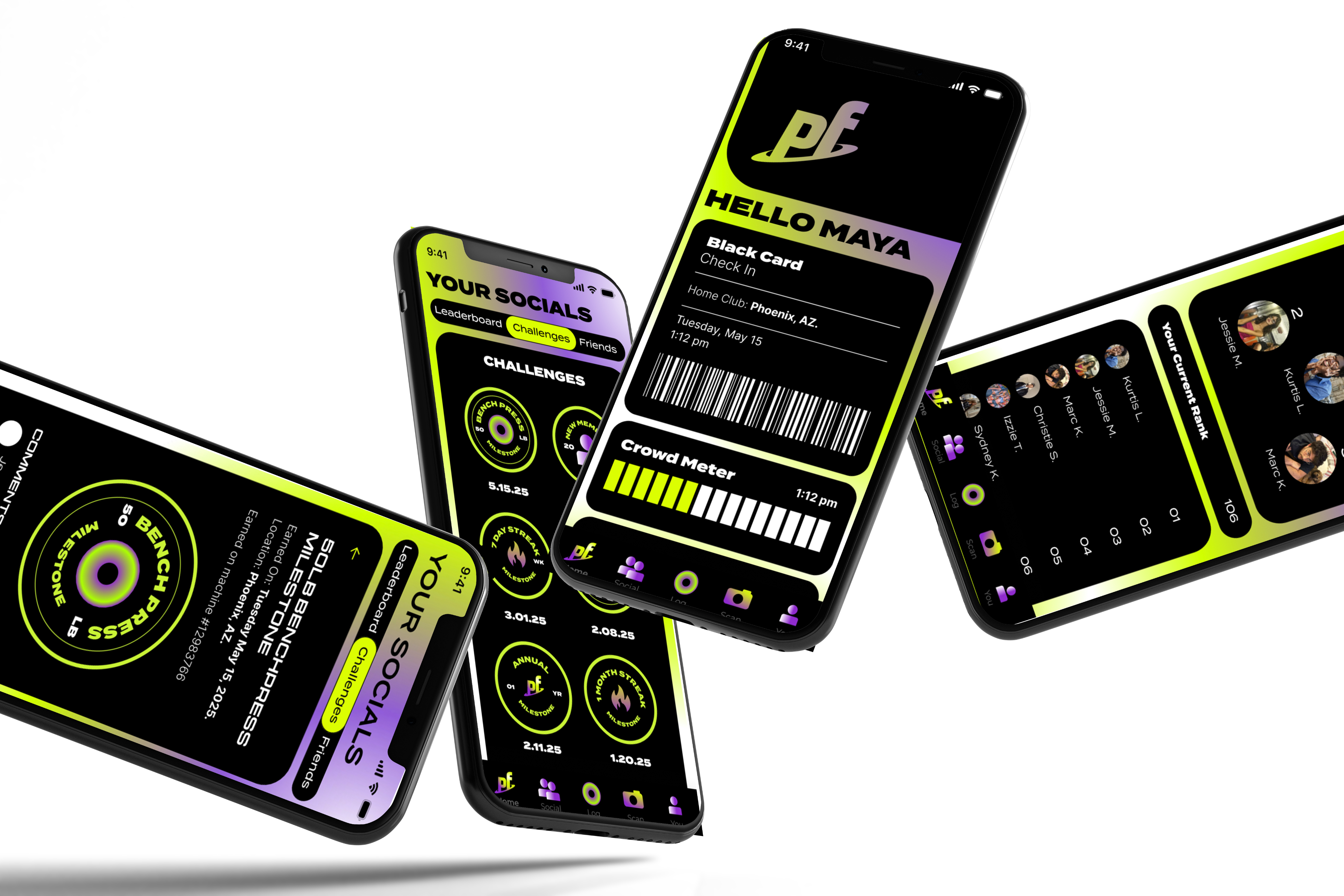
App Redesign
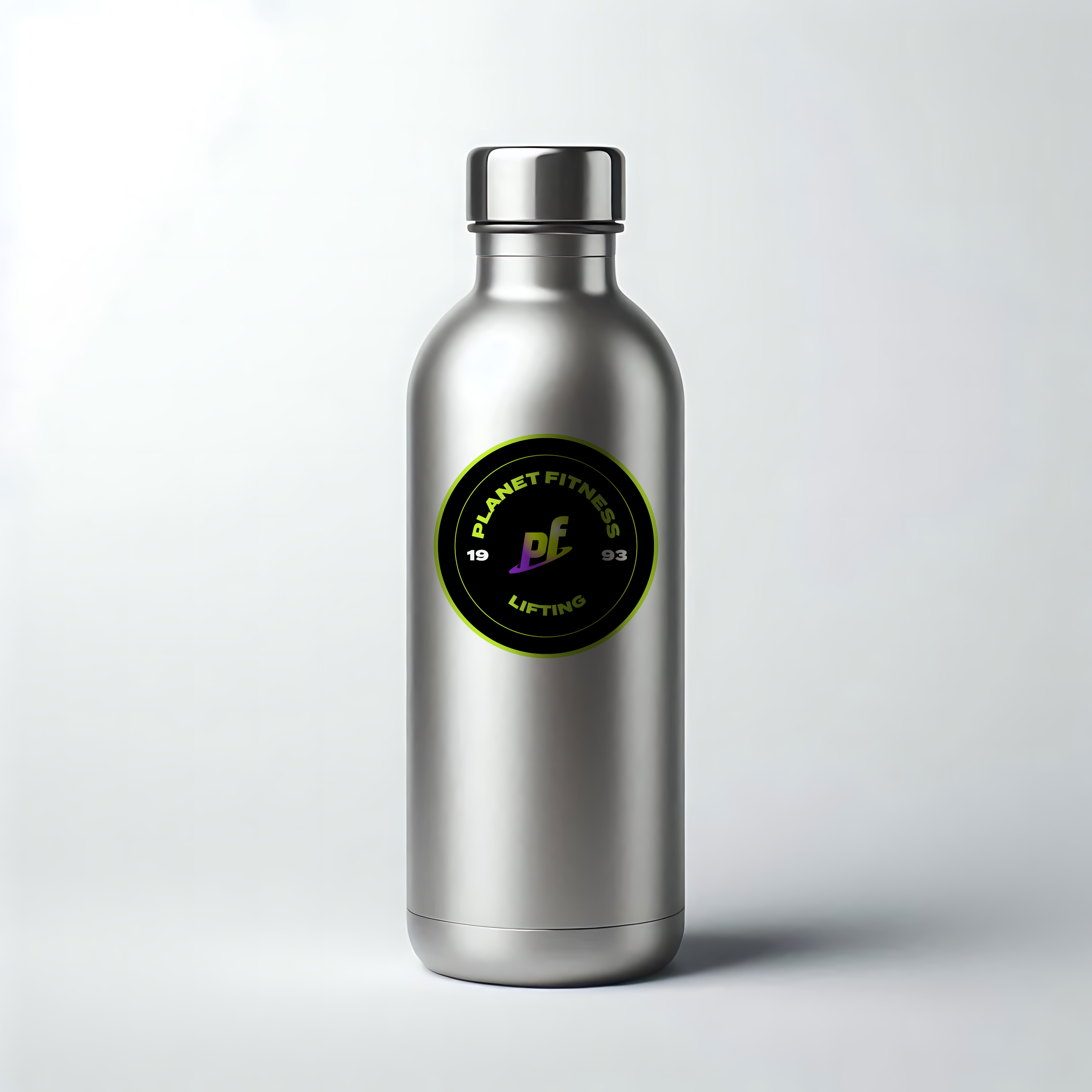
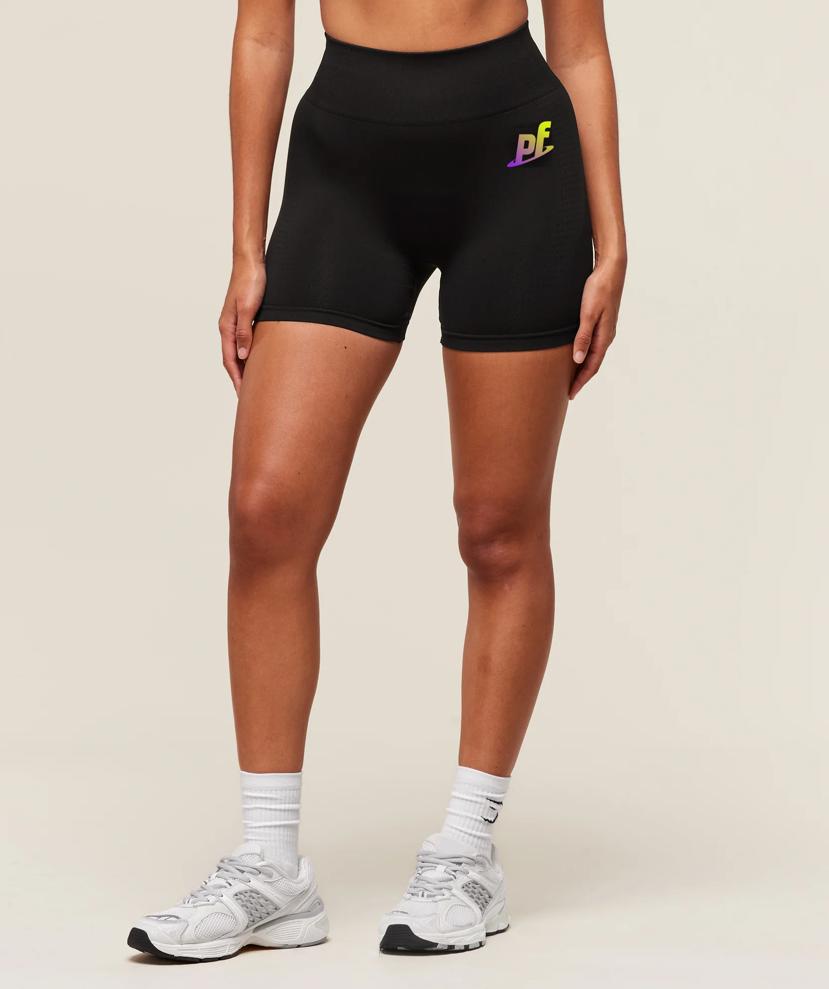
Logos
2025
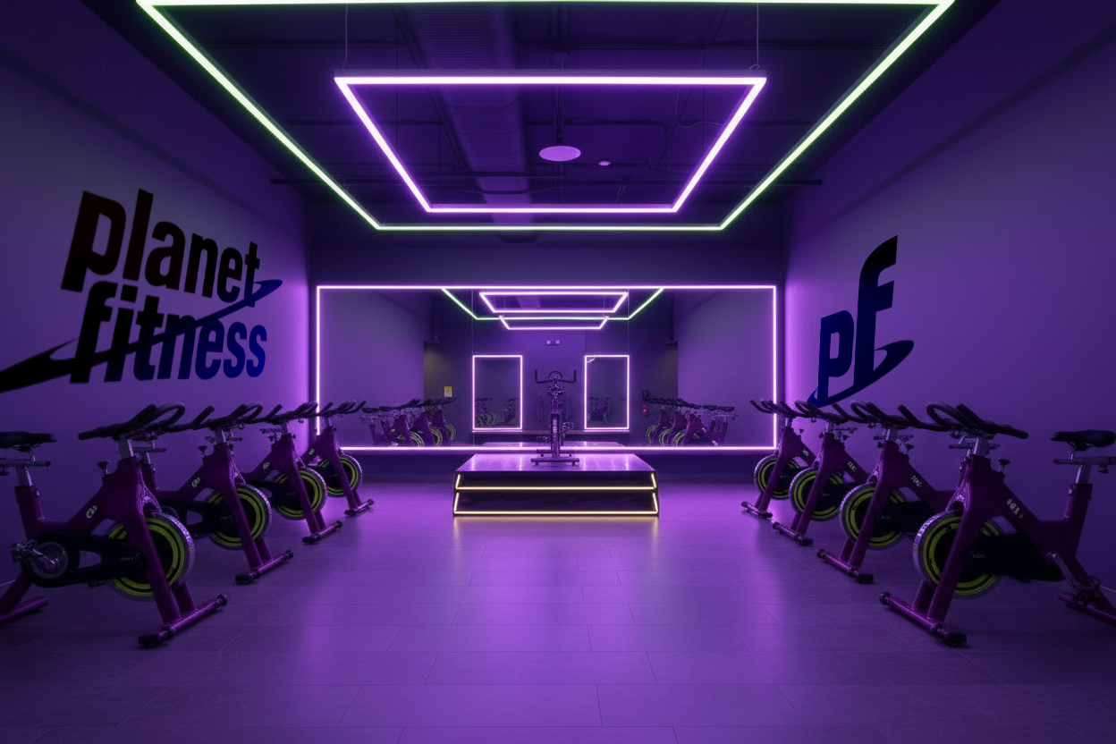
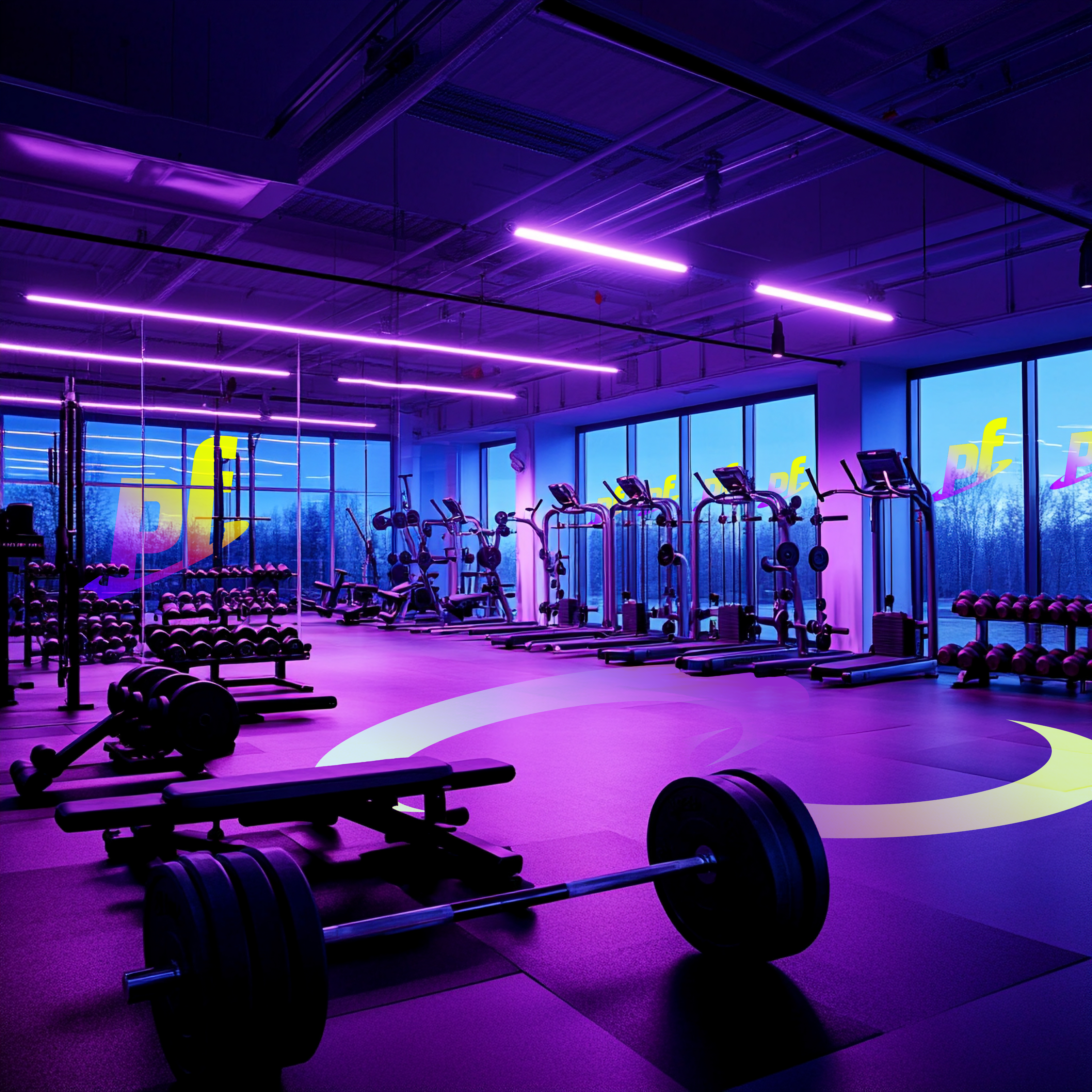
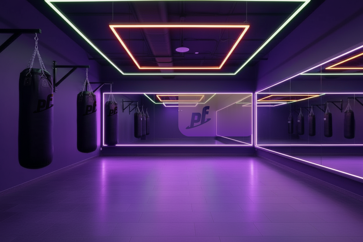
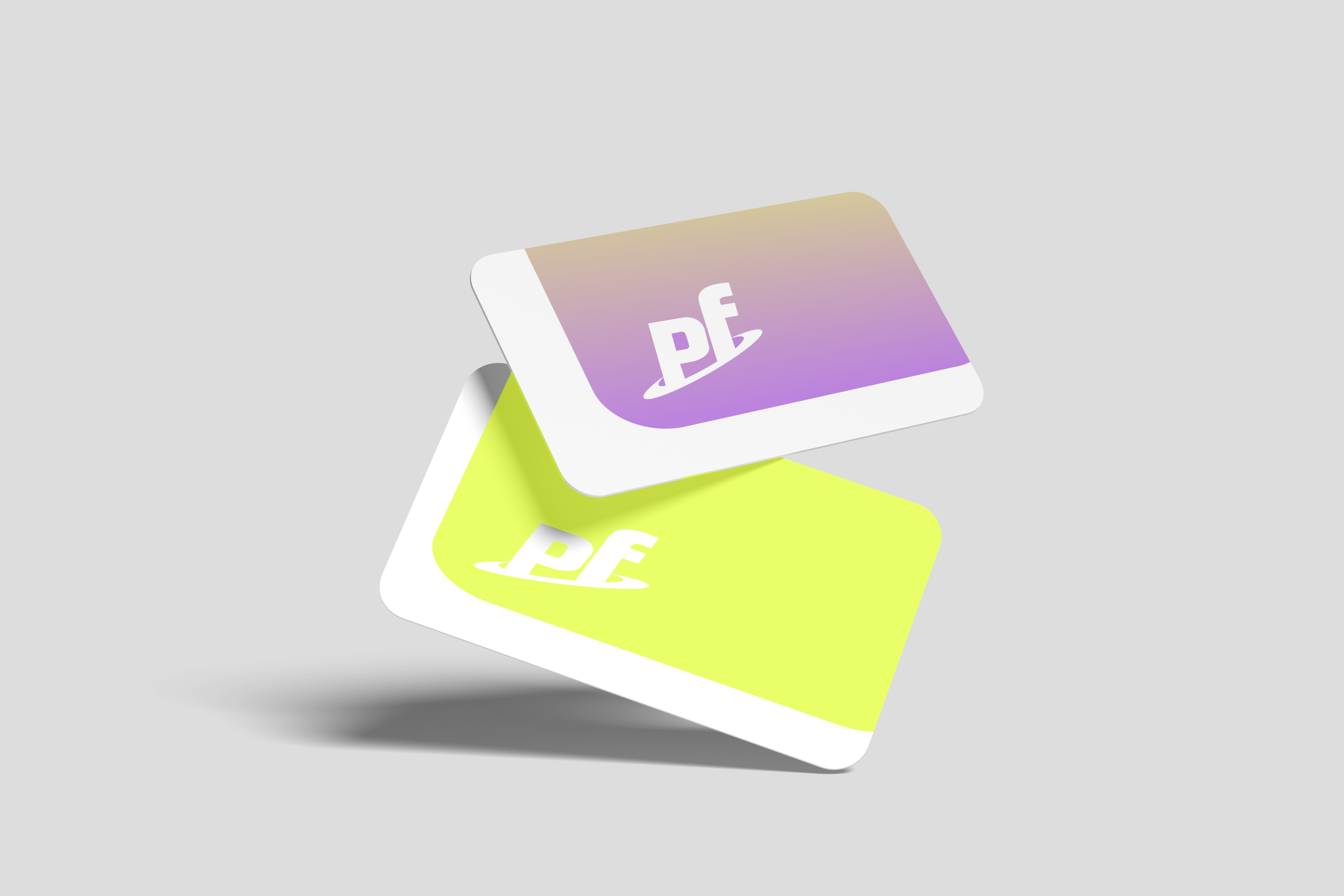
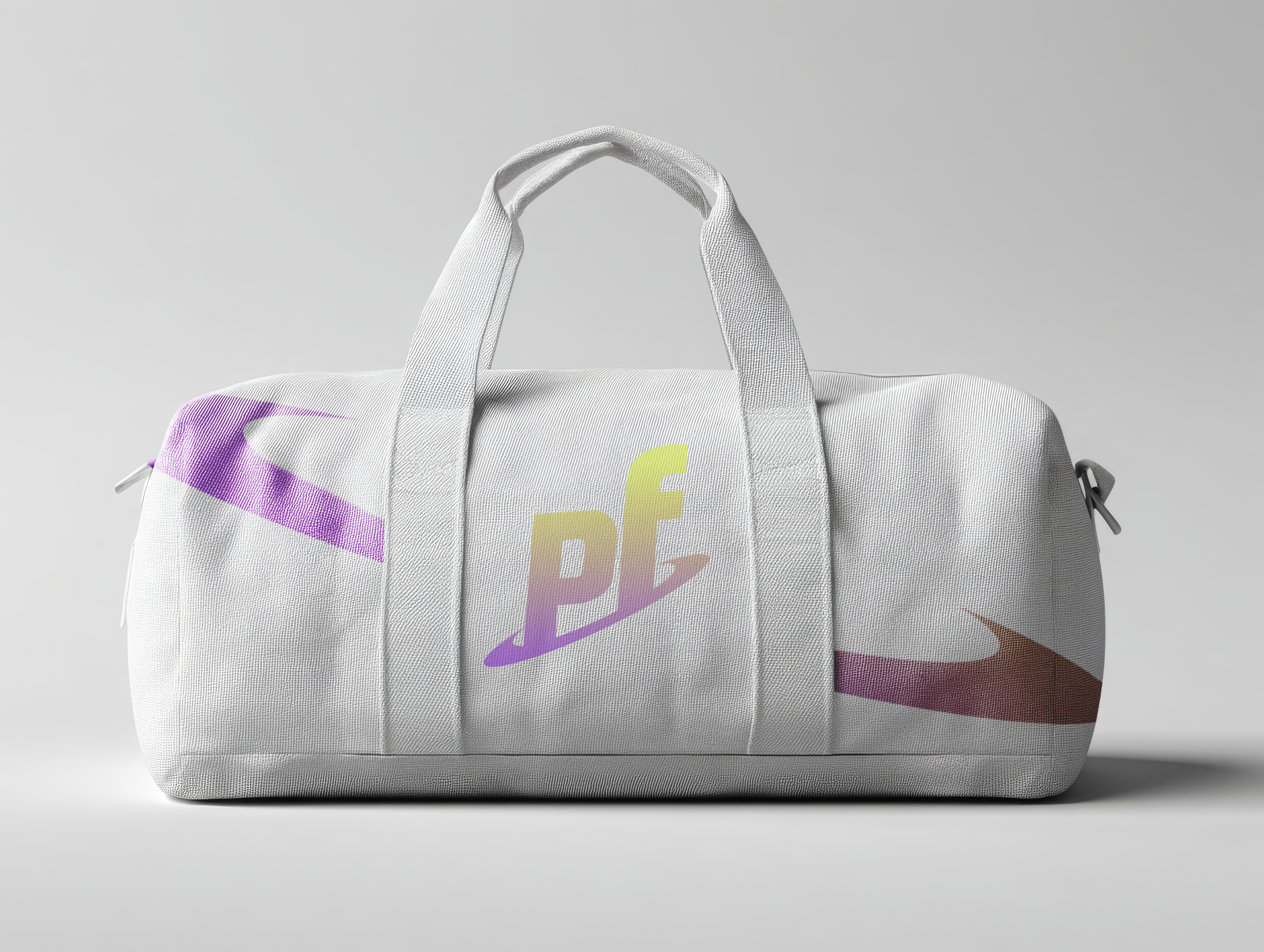
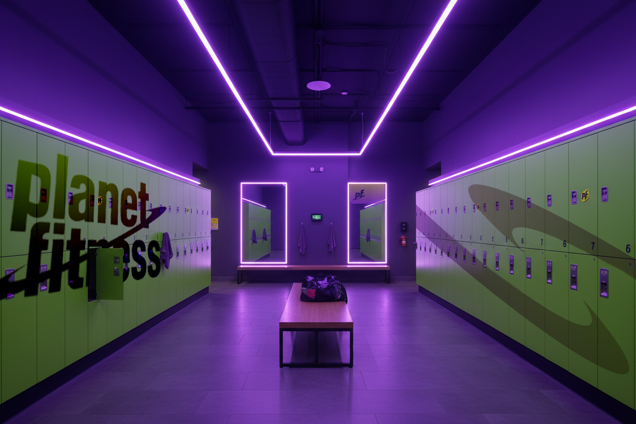
Planet Fitness Rebrand
Group Student Work

AI & Photoshop
AI & Photoshop
AI & Photoshop
AI & Photoshop

Back to Home


Executions
App Redesign
Logos
2025
Figma
Figma
Planet Fitness Rebrand
Student Work
AI & Photoshop
AI & Photoshop
AI & Photoshop
AI & Photoshop

Back to Home


Solo Student Work
Planet Fitness Rebrand
Executions
App Redesign
Logos
Adobe Suite
Figma
Figma
Back to Home
AI & Photoshop
AI & Photoshop
AI & Photoshop
AI & Photoshop
